Turkey’s leading online food ordering platform Yemeksepeti.com and grocery order service Banabi renewed their logo and design. The first details that stand out in the innovation are the font and color difference.
Using the same logo for 20 years Food basketAs of this morning, it went through a significant change. The company’s current logo and design is better than before. more minimalist looks. It seems that a font with softer lines and a pink background are preferred.
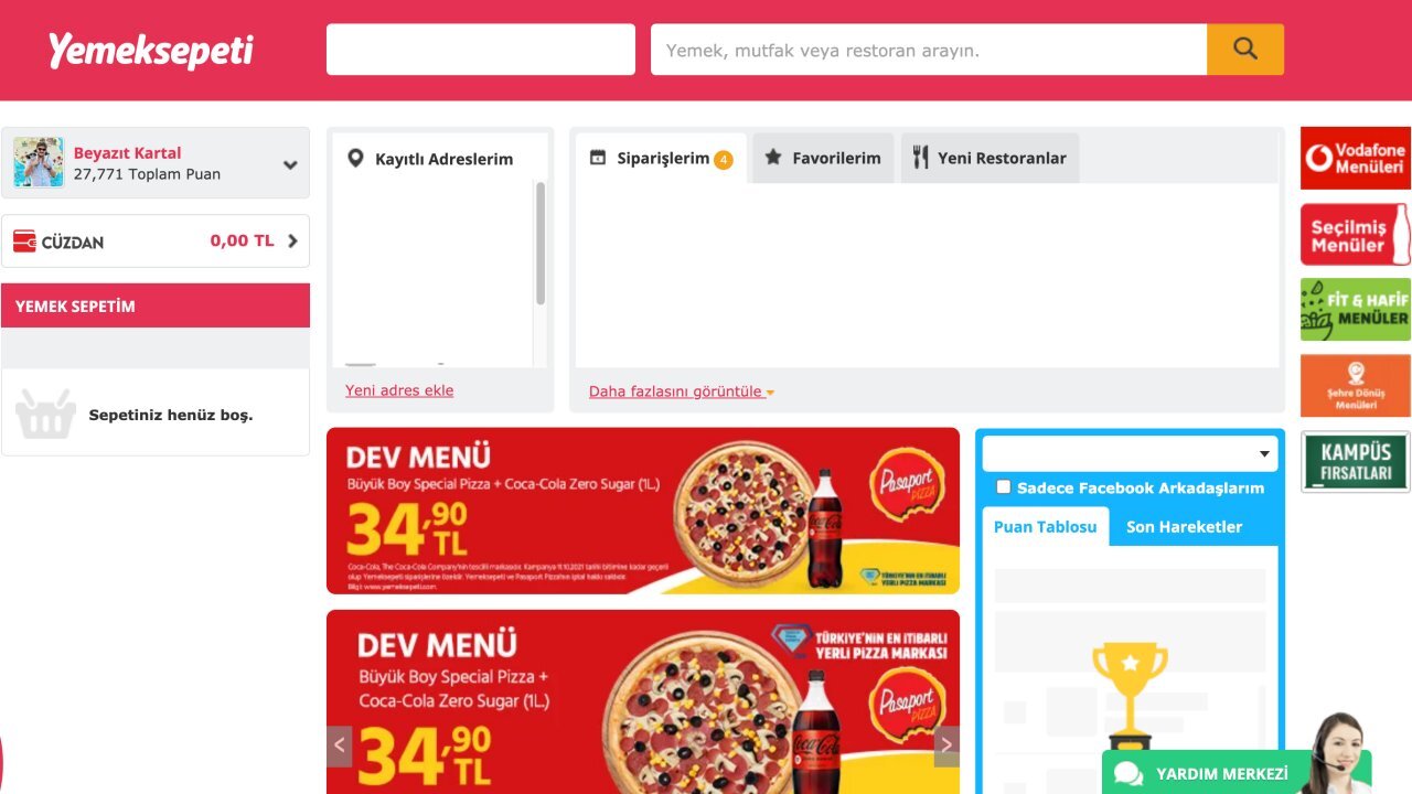
The most radical change is the famous deletion of the courier figure. Although the courier figure identified with Yemeksepeti has been removed from the logo, it is still used as an icon in browsers. There are no serious changes in the interface of the site, only some minor color and font differences draw attention.
This is what Yemeksepeti’s new logo looks like:
Famous courier image and the color red is radically obsolete.
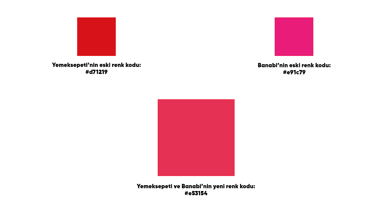
The design of the Yemeksepeti initiative Banabi was also changed.

finger figure removed, it seems that a framework has been introduced in its place. Also, while the brand colors of Yemeksepeti and Banabi were different, they now have the same colors.
The codes of the colors in the new design are as follows:
With the new design, the site now looks like this.
So how did you find the new design?