Disney+ changed its logo. Although the change in background color is not an official statement, it most likely represents the platform’s merger with Hulu.
Disney+, one of the world’s most popular cinema and TV series platforms, has been using the same logo for a long time. This logo was dominated by a blue color close to dark blue, inspired by the company’s memorable Cinderella Castle.
However, there has been a change in this recently. company, platform with a brand new logo started to present. The new logo does not change anything regarding Disney+’s name. The part that changes is the color of the background. When you search for the platform in application stores or enter its website, you can see that the new logo has started to be used.
Here is the new logo of Disney +
*Old logo (left), new logo (right)
Why was there a change in Disney+’s logo?
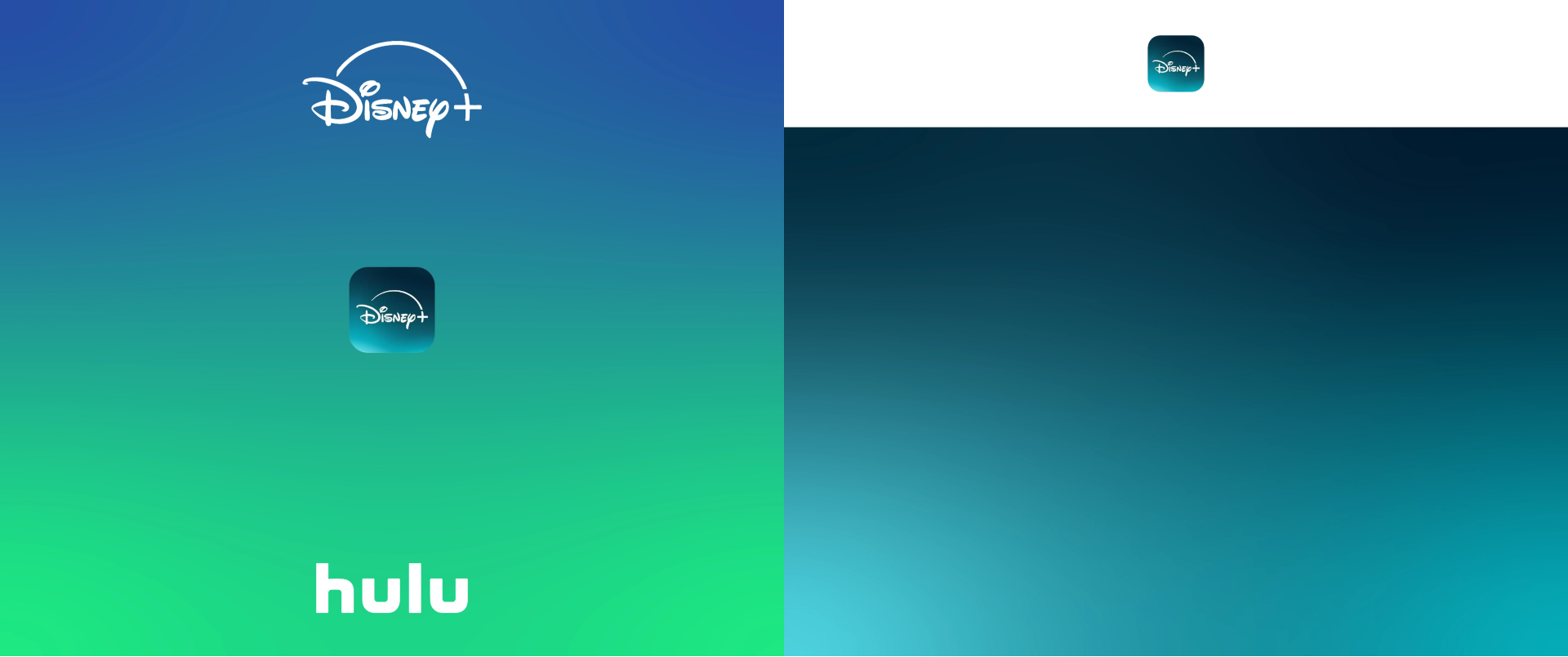
*Reddit user named Lanceoz combined Disney + and Hulu colors.
There is no official statement from the platform about the logo change. But there are some guesses. The most likely of these is that it represents a combination with Hulu, another movie series platform. Disney purchased Hulu a few months ago for a huge amount of $8.6 billion. After this, work began on the merger of Disney + and Hulu. If this is the case, we can say that the new logo is not surprising and makes sense for the company.
It should be noted that Hulu has a green logo. This combined with Disney’s blue creates something similar to the new logo. The image you see above, which combines the colors, also supports this. The image was created by a Reddit user named Lanceoz.