When making a decision, we always want it to be the best and perfect, right? For some brands, this is not the case. In this content, we will look for an answer to the question of why brands deliberately choose defective logos.
Chasing perfection isn’t always the best choice. Like Starbucks and Google giant brands Their logo choices prove this to us.
These brands, which show us that sometimes “imperfect” things can produce “perfect” results, knowingly choose logos with some errors. well thought out reasons lies. In other words, even what seems like a “flaw” is actually a “flawlessly” thought-out strategy.
Let’s go through examples and start with Google’s logo.
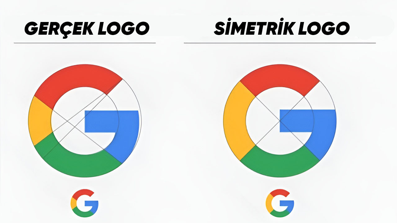
At first glance, Google’s letter “G” logo looks pretty neat, right? However, if we examine it in detail, we see that the letter “G” is geometrically you’re not perfect we can see.
Inner circles that do not align with each other, lines that do not intersect, and inconsistent color distributions are actually geometric and flawed by design It reveals a logo.
But the perfection of this logo is hidden in its flaws!

There’s a reason the Google logo isn’t perfect. In typography “overshooting” The concept actually means deliberately pushing the curved parts of a text beyond the boundaries.
Although this situation is symmetrically and geometrically incorrect, it is used in order to obtain a natural appearance that will deceive the human eye. an optically correct result enables it to be obtained.
The small changes we made when we recreated the logo symmetrically, as in the image above. big differences We see you create.
The blue part protrudes too much, the yellow color overshadows other colors next to it, etc. Google, considering all situations, is symmetrically wrong, but when the human eye is taken into account easy to look at and balanced in every sense uses a logo.
In other words, Google created an “imperfect” logo that would make it comfortable to look at without compromising the brand colors. thinking perfectly preferred.
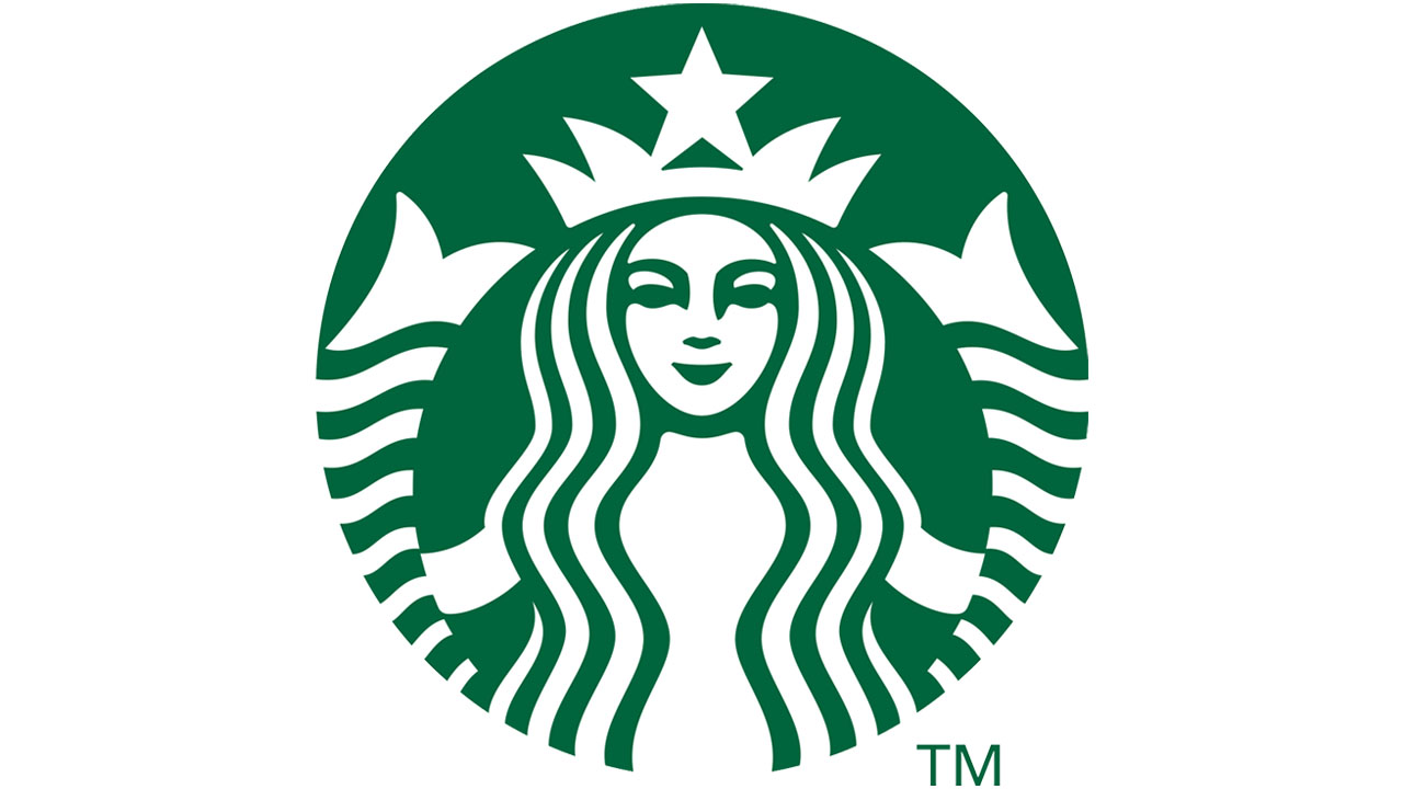
Let’s examine Starbucks’ iconic but “imperfect” mermaid logo.

This famous logo of the brand is also asymmetries contains.
For example, one side of the mermaid’s face shadier than the other.
The main reason for this is to make an asymmetrical face look more human!

When we examine the different logo designs above, we see that the face is quite symmetrical. away from humanity is seen.
The design team will also be aware of this situation so that instead of a cold drawing, a mysterious and To create a human figure They chose to create a “defective” design.
In summary, Google, Starbucks and many other big brands primarily manage their perceptions they want. No matter what mathematics and symmetry say, their aim is to attract the attention and admiration of their customers, that is, us. To impress us better They think so carefully.
Don’t say it’s a minor asymmetry issue. That’s how brands are with carefully thought-out movements We can also say that he is trapping us in his net.
Our other content that may interest you:
RELATED NEWS
Why did Apple, which has made a name for itself by advocating simplicity, once preferred a rainbow-shaped logo?
RELATED NEWS
Why Did Ford Make the Mustang’s Logo Different While It Uses the Logo We Are Used to in Every Model?
RELATED NEWS
