
Some brands knowingly or unknowingly design their logos in such a way as to convey a sexual meaning at first glance. Let’s take a closer look at 18 interesting logos that you will be surprised to see and say that this is not enough.
Undoubtedly, one of the most important features a logo should have. striking that is. They also contain messages related to the main theme of the company.
But some logos are much more than the message about the main theme. sexual implication noteworthy for its content. It is not known whether such logos are deliberately designed like this, but they certainly look bad.
Here are some badly designed logos that will mislead you at first glance:
While a pagoda (Buddhist temple) was wanted to be depicted in front of the rising sun, the work gained a completely different dimension.
This logo was designed for the Oriental Research Institute at the University of Santa Catarina. Looking carefully The roof of the temple in front of the sun noticeable, but at first glance it seems too obscene.
Perhaps the worst logo ever designed for a Catholic church.
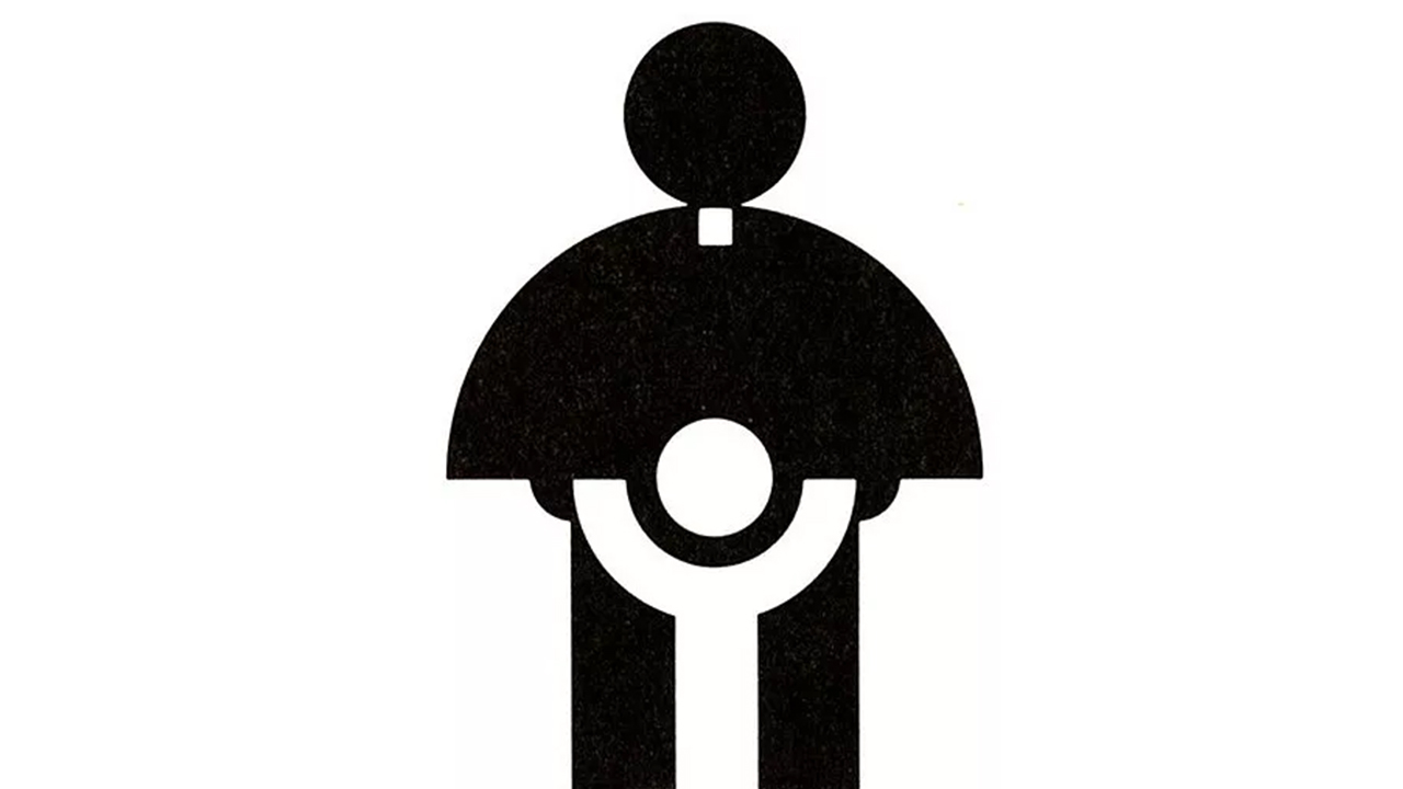
This logo, which was designed for the Archdiocese Youth Commission in 1973, was changed later, but the first logo that comes to mind is always in this drawing. The logo, which has a very bad design, was once a gift from the Art Directors Club of Los Angeles. even got an award.
Although it may seem like an ordinary logo at first, a careful look at the dots above the A reveals an erotic implication.
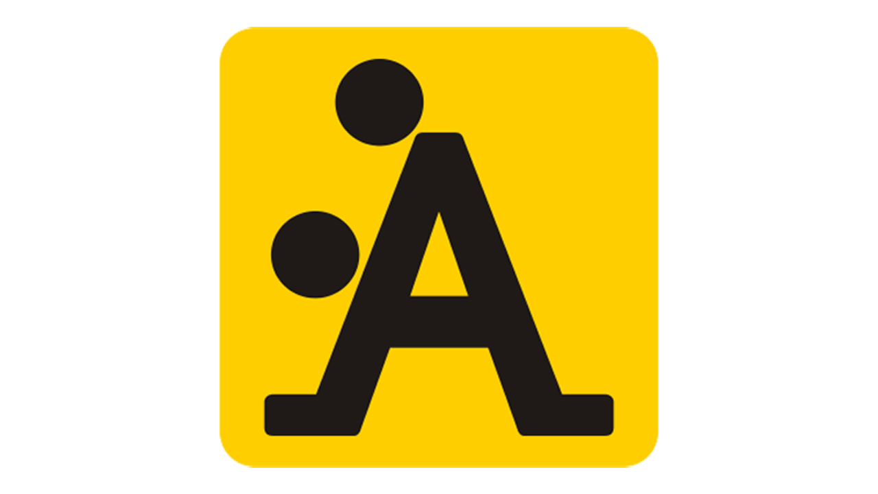
The logo of the A-Style brand was originally an example of guerrilla marketing. The logo, which was first affixed to certain points of Italy as a sticker; In a short time, it attracted attention in the whole country and then in certain countries of the world. When the brand reaches its goal logo-specific products started to take off.
One of the best examples of logos that shows that you need to be more careful when choosing the font and the spacing between the letters.

MEGAFLICKS>MEGAFUCKS
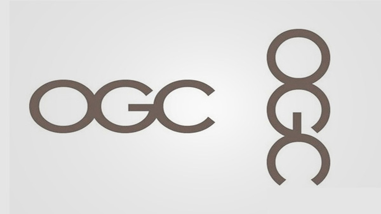
It’s fine as long as you don’t rotate the logo ninety degrees clockwise.
When the British State Trade Office introduced this logo in 2008, many users noticed the image on the right and the logo did not fall into the agenda for a long time. So the trade office Had to change the logo.
When you see a naked female body in this logo, you cannot see the dancing couple again.

Whoever sees this logo gives up going to the dentist.

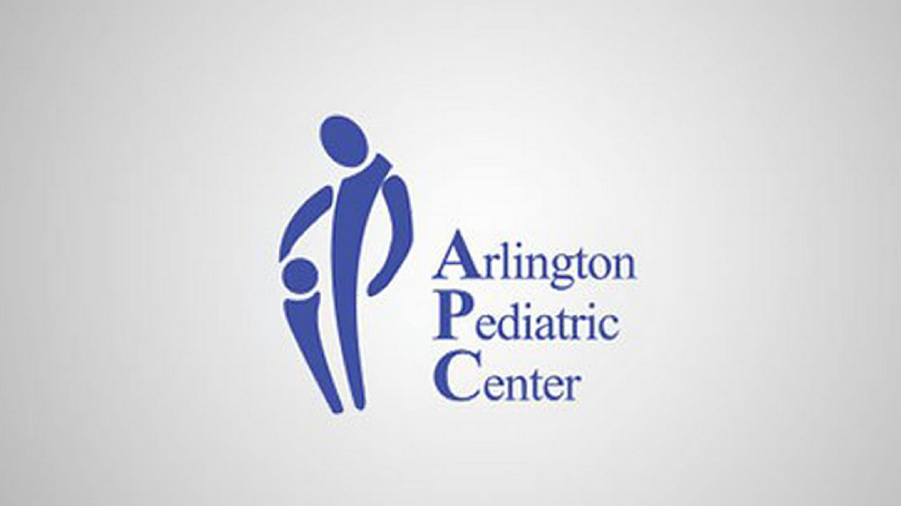
Couldn’t put the third child aside or didn’t it occur to you to add facial expressions?
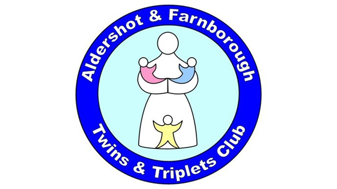
Choosing such a logo by the child health institution must have caused great reactions because the institution changed its logo.
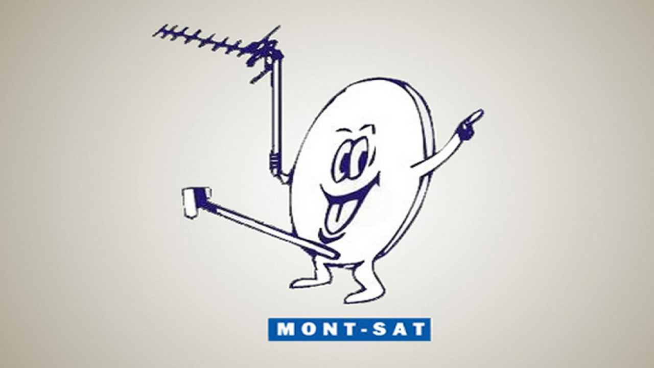
They may have wanted to prove the gravity of the dish antenna.
I think the space key on the keyboard was broken: Children’s toy, clothes change shop (KIDS EXCHANGE)

They hid it in the logo so that no one would ask what’s in the pizza sauce.
‘I will wear it on Haydar Bey, Haydar Bey will wear it on Mehmet Bey, and Mehmet Bey will wear it on me…’

What is the love of putting a dot on these letters and “merging” them?
Even though they claim to be a mouse, it looks more like something we don’t want to keep.

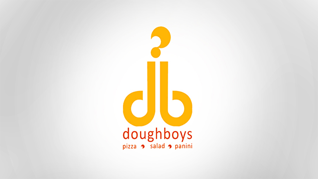
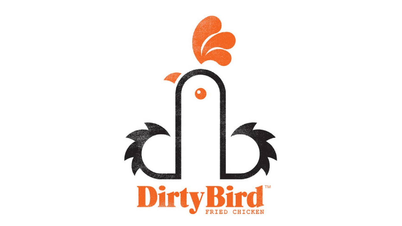
If possible, it is forbidden to use the letters d and b in this way.
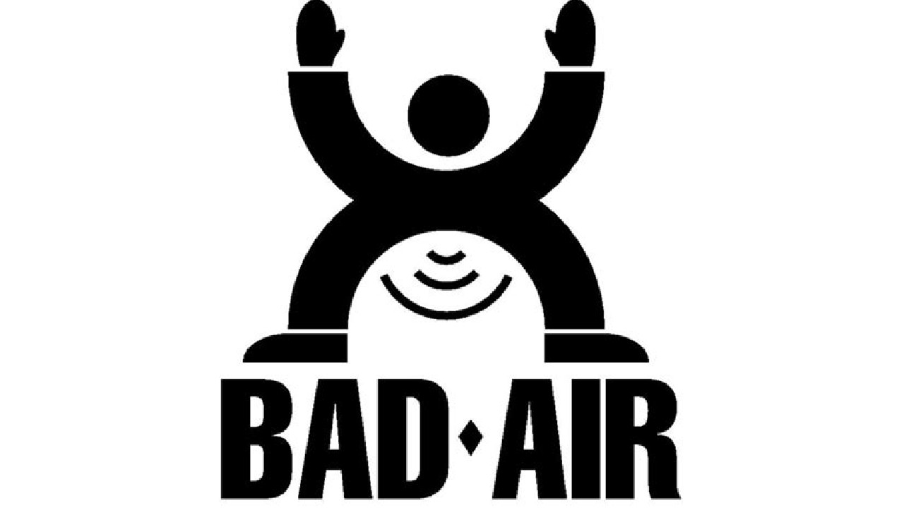
If the weather comes out of here, of course it will be bad.
We provide our own security, thank you.

RELATED NEWS