
Amazon, which is one of the websites we will prefer for online shopping thanks to many aspects, does not seem to attach any importance to the site interface that looks like it is from the 90s. But why? Is it just because they “don’t rock it”?
Consumers around the world using Amazon In terms of functionality, there are not many problems with the site’s interface. It is easy to use.
However We cannot say the same for the image issue. It looks boring, static, colorless. Couldn’t Amazon, one of the biggest companies, fix this if it wanted to? Why does he still continue to use this interface?
The company is among the brand giants.
After Apple and Microsoft, Amazon It is the third most profitable company. Their annual revenue is 280 billion dollars! We can also say that if Amazon were an independent country, it would be the 86th largest country in the world.
So to users Provides trust and satisfaction Can not be denied. Even many of you reading these lines have shopped from Amazon at least once in your life. He was even surprised by the speed of shipping.
So why are websites so bad?
When I went to Amazon after seeing themes on other websites Our eyes are bleeding. One reason is that the company’s text-based user interface design strategy is based on usability.
Since Amazon’s launch in 1994, In terms of UX (interface design) There has been little change. Even in the infancy of the internet, anyone with even a little digital knowledge could easily use Amazon’s interface.
It stood out not with its appearance, but with its other functions. When it comes to fast shipping They were the first site that came to mind. Redesigning websites could alienate customers from the site to some extent.
The site focuses on highlighting important features rather than aesthetics.
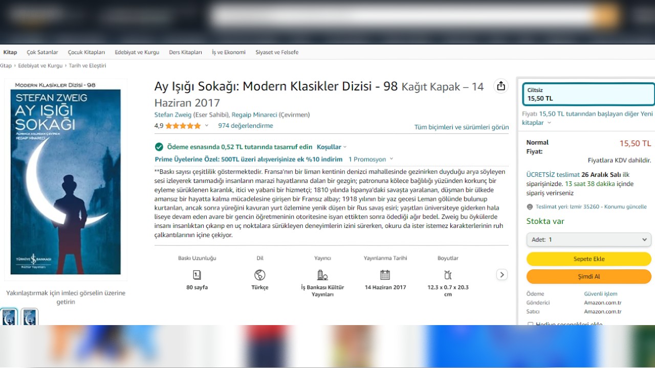
Amazon’s purpose is to sell things. Based on this purpose, we can achieve everything we want on the site. least click We can reach you. It has everything we expect from e-commerce, including related products, reviews, one-click purchasing.
So, the fact that it does not have a colorful and lively design does not actually make it a bad site. Amazon interface design leader Mark Pearson also said that instead of making designs that appeal to users, focus on business goals says.
In other words, they basically remain the same, but we cannot say that they do not change at all…
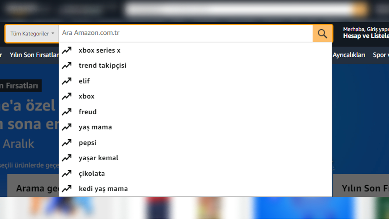
The search bar has been expanded to increase its visibility on the site. Product categories section included in the title menu. Thus, readability is facilitated while navigating the site.
Tabs have also been updated, and sections previously labeled “books” and “electronics” are now based on users’ browsing history appear as titles. Amazon is known to sell a wide variety of products; It focuses on discovering and reminding users about things they like.
In short, they care about function rather than appearance.

What Amazon cares most about usability and accessibility, It seems to be quite enough to attract and retain users, so we continue to use the site no matter how bad its design is.
Function same mold image A slightly improved website Couldn’t it have been designed as well? That’s debatable. Maybe the only reason for what we are thinking about so much is Mark Pearson’s laziness…
Our other content that may interest you:
RELATED NEWS
Why Does Amazon Ship Even Very Small Items in Large Boxes?
RELATED NEWS
How Can Apple Products Be Sold Cheaper on Amazon?
RELATED NEWS
How Did Amazon Become the ‘World’s Most Valuable’ Company Again?
RELATED NEWS