
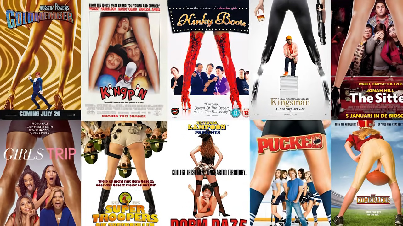
Movie posters are a very important factor to capture the audience at first glance. Of course, in order to use this factor effectively, many films use almost the same poster style. However, things are not as simple as we say, there is a much deeper strategy behind it!
When you go to the cinema, you see many movie posters. are almost identical Have you ever noticed? Especially in the romantic comedy genre, almost everything is the same, from the smile to the pose of the characters standing back to back.
However, this situation It’s not just limited to romantic comedies. How to Lose a Guy in 10 Days? We can also see similar poses in movies such as My Ghost Lovers. Let’s examine the reason behind it together.
Movie posters have been one of the most important tools to convey the story, spirit and aesthetics of a movie at a glance since the first days of cinema.
However, since the 1990s, poster designs A clear trend of imitation emerged. Cult films such as Pulp Fiction and Jurassic Park created their own posters inspired by other works of art.
Since then, certain themes and design elements have emerged, from giant faces to romantic scenes on water. It has become used again and again.
Elements such as color palettes, clothing and poses used in movie posters are critical in communicating the genre and main theme of the movie.
Women wearing a red or pink dress, attracts audience attention and identifies these characters as the focus of romantic attention.
On the other hand, for thriller or action movies, vigilante characters are usually seen from behind; in psychological thrillers It is expressed through close-ups of the pupils.
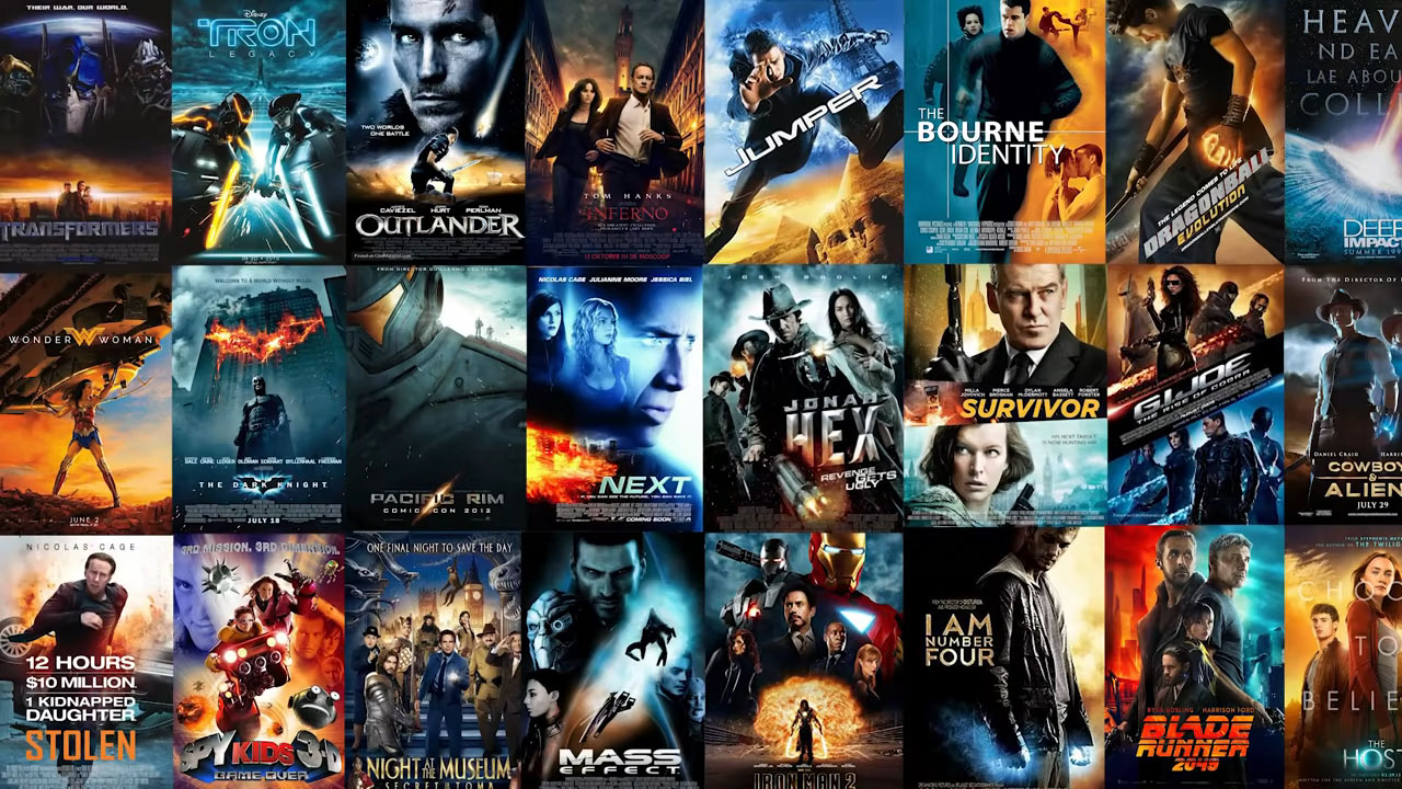
In addition, the use of color in movie posters, especially in action movies, Preferring contrasting colors such as orange and blue, It plays an important role in setting the atmosphere and tone of the film.
These two colors; such as fire, water, explosions and technology representing opposing concepts basic color theory where contrast enhances drama and captures the viewer’s attention is based on principles.
Movie posters are designed to attract audiences to movie theaters and are of great importance for marketing strategies.
According to the Motion Picture Association of America; average marketing cost for a movie, can reach millions of dollars. This requires designers to stick to proven success elements.
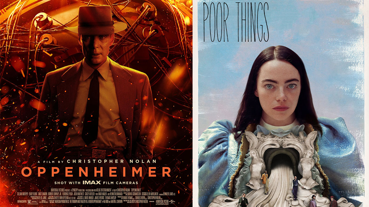
Looking at the posters of Oscar nominated filmsAlthough it is possible to see more original designs, the similarities between movie posters in general cannot be denied.
What about you, have you noticed this situation before? We are waiting your comments.
You can find our other contents that may interest you below:
RELATED NEWS
Why Have We Started Seeing More Friendly Robots and Artificial Intelligence in Movies in Recent Years Compared to the Past?
RELATED NEWS
There’s a Strange Reason Why This Spooky Melody We’ve All Heard in Movies Gives Us Goosebumps!
RELATED NEWS
While the CGI Quality Was Very Good Even in Movies 20 Years Ago, Why Is It All About Instagram Filters Nowadays?
RELATED NEWS
Why is the “Yellow Filter” Used in Scenes Set in Countries Like Mexico and Türkiye in Hollywood Movies?
RELATED NEWS