Giant beverage brand Fanta has switched to a new logo. With the renewed identity of the brand, the orange color in the logo was also bid farewell.
One of the world’s most popular beverage brands last week Pepsihad returned to its 1980s logo with a modern twist. The new logo now consisted of a single circle, offering a more minimal image.
A new one has been added to the minimalist logo changes in brands today. Beverage brand within Coca-Cola Fanta, has switched to a new logo where it says goodbye to its iconic orange color completely. Also, the leaf on the logo has disappeared, leaving only the word Fanta.
Fanta’s new logo:
Fanta’s previous logo:
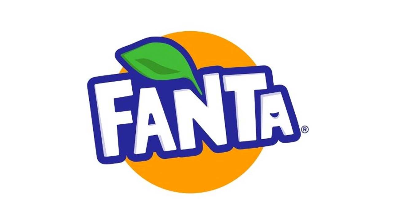
Unlike the previous logo, the new logo now includes a three-dimensional text effect as a starting point. The blue part, which forms the extension of the logo, starts from a single point and extends to the Fanta text and covers its surroundings.
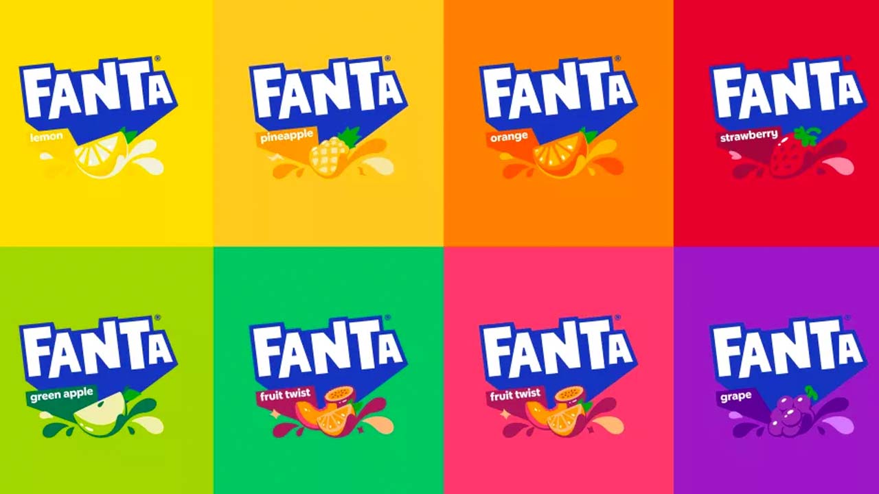
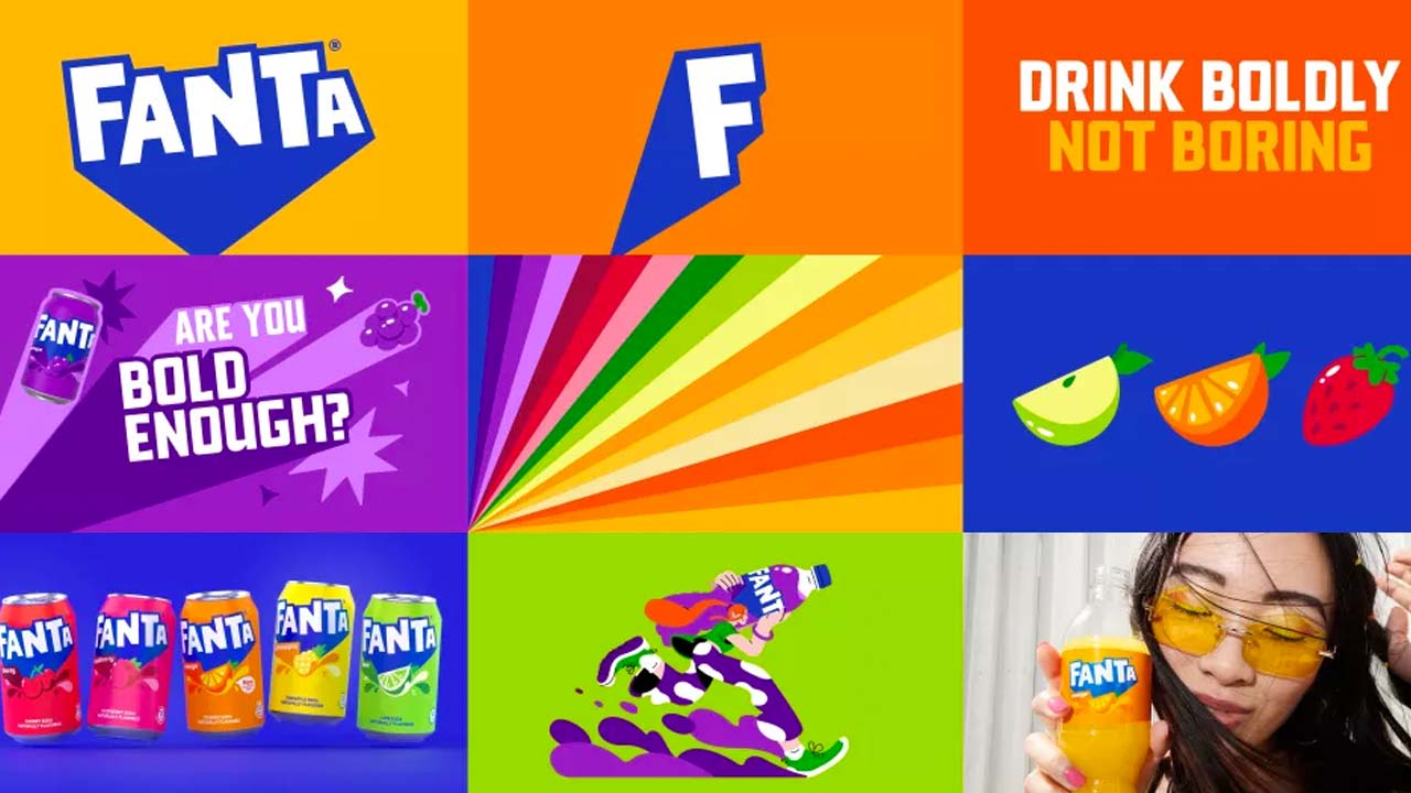
Created by Jones Knowles Ritchie, the new logo aims to “inspire people to find the fun in life and make the simple fun, with a look that remains perfectly Fanta,” according to Fanta’s description. The new language of the brand is displayed in its products and images as follows:
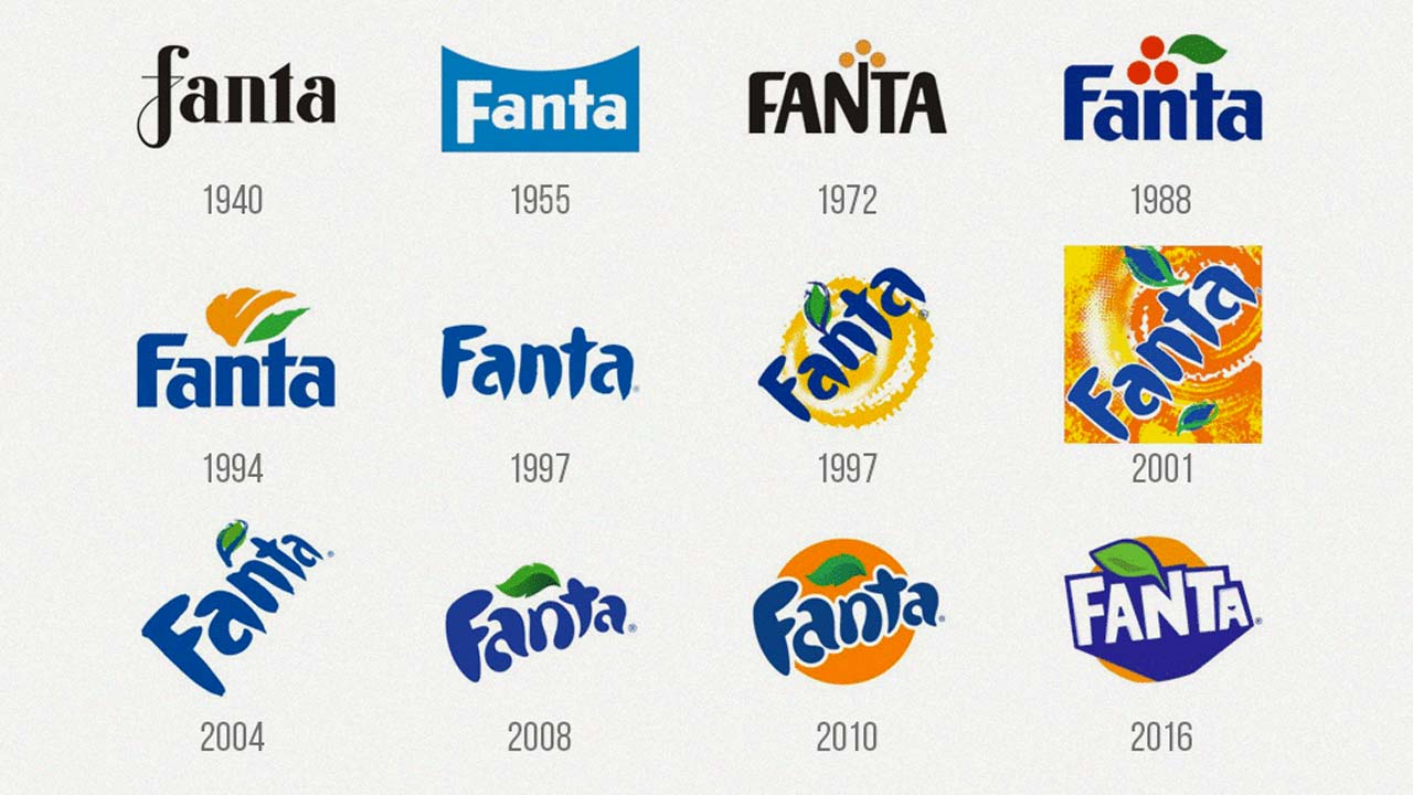
This is how Fanta’s logos have changed over time:
RELATED NEWS