

The cryptocurrency market has been on a crab walk lately, neither fully up nor down. The market is going very flat and there are serious decreases in volume. So, what technical data and network statistics do we have? What does this data say about the direction of the market?

This analysis will clear the doubts and give us clues about the future of the market.
Hello all my friends. First of all, I wish you all a happy new year. It is normal for the markets to be calm and voluminous during the New Year’s week. $BTC On the other hand, there is a similar situation. If you want, let’s make a detailed analysis right away. #BTC
— Furkan Bozkurt (@BzkrtFrkn) January 1, 2022
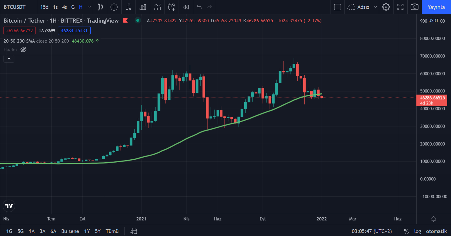
First, it is important to thoroughly understand the current situation. Below we can see that the 50-week average (green) is forming an upward trend. It is almost as if it forms the lower limit of the price and collects the price. So, the overall picture says we are in an uptrend. We know the trend we’re in. Well, what can we say for the future?
First, the red level present in the chart below acts as support. It’s been tested three times before (the last test is pretty voluminous) and it’s been able to stay on top of it. For this reason, it is one of the major supports that should be followed. It is normal to have pullbacks up to the red support level. It is important that it does not go below this level. Otherwise, it may push us below $40,000.
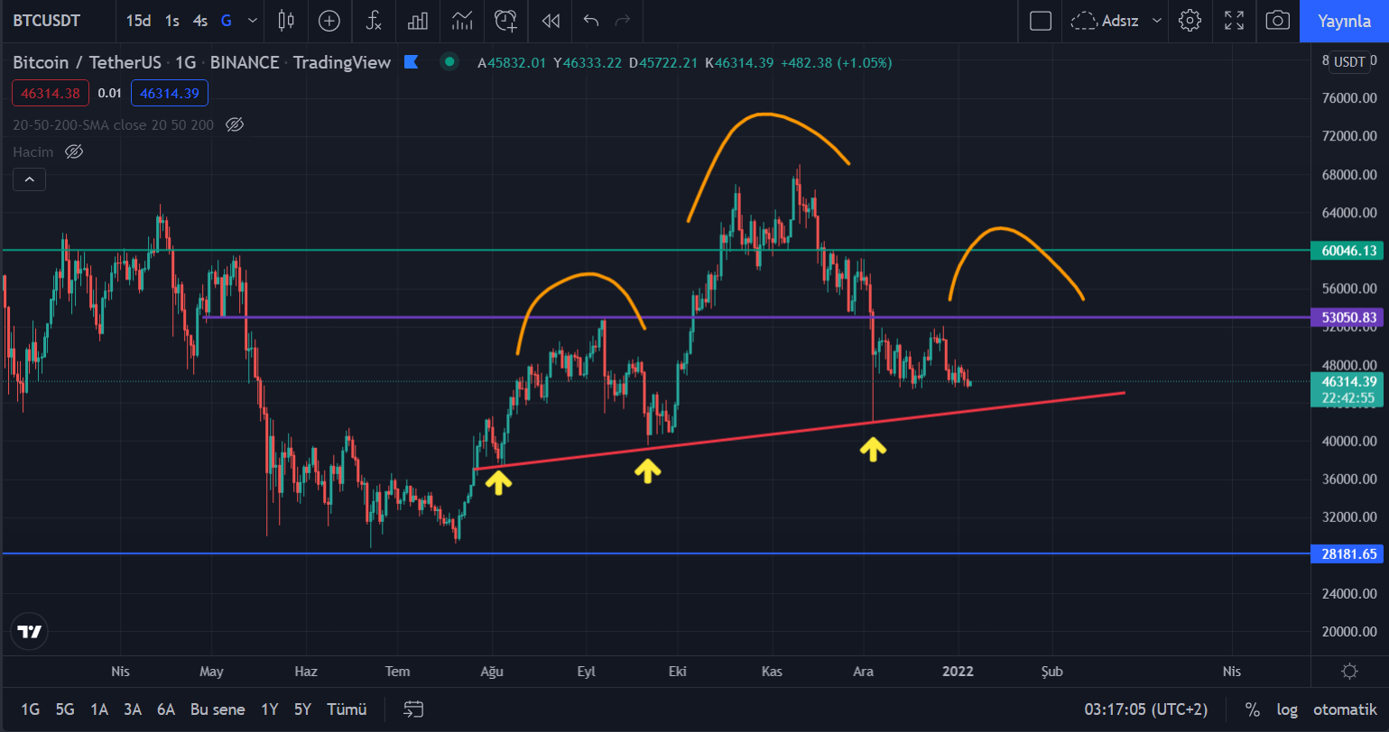
We can also see above that an OBO image is formed. This means that we can find buyers near the red support level and experience another rise. So, how the price reacts to this red support is important and should be watched.
What Does Onchain Data Say?
On the other hand, in the chart below (Number of active entities), we can see that the orange level rose sharply during the 2016-17 rally and the 2020-21 bull. During bull periods, there is a significant increase in the number of active assets.
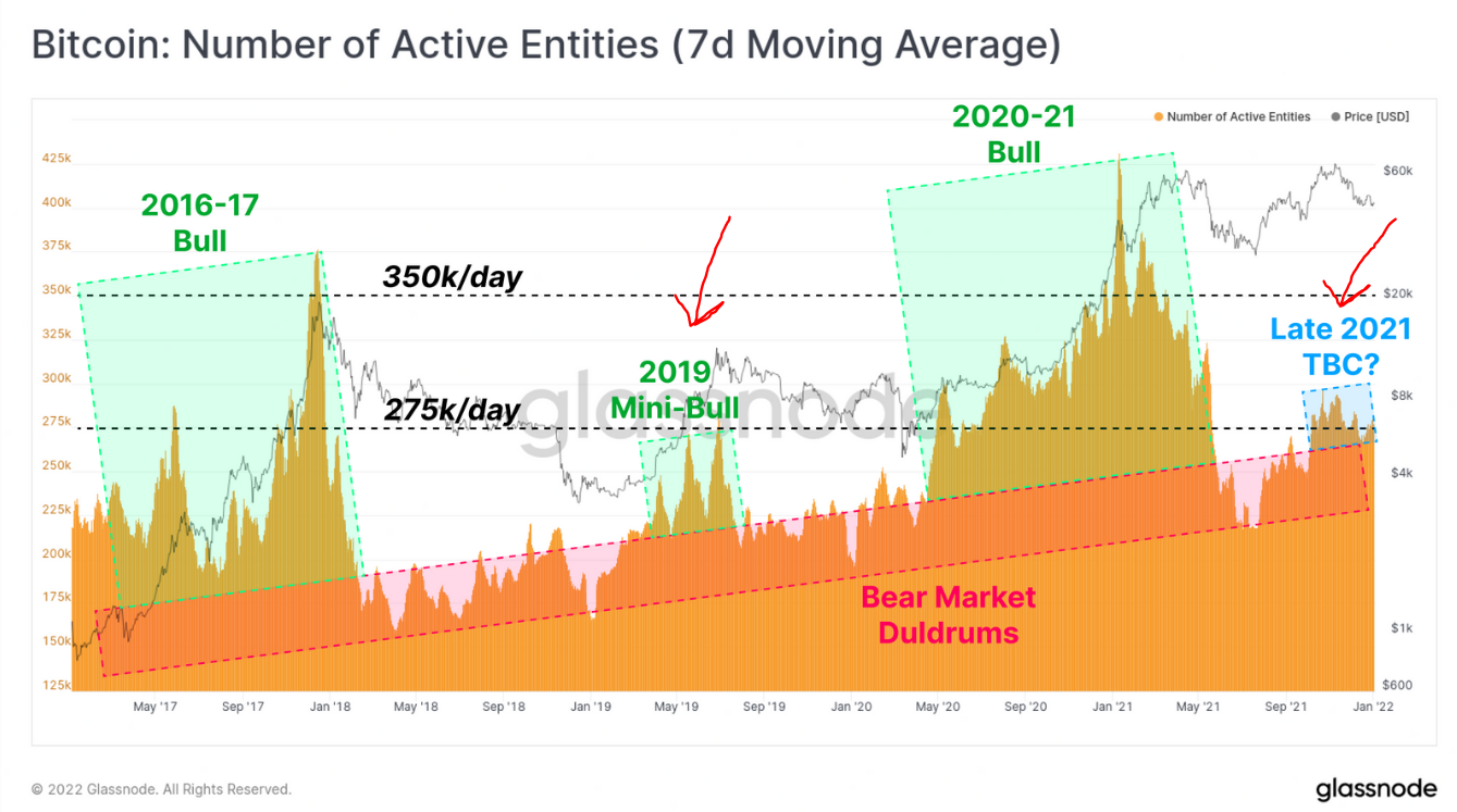
While active assets increased rapidly during the bull run, when Bitcoin first reached the $ 60,000 level, we cannot see a significant increase in active assets in this last $ 60,000 visit. There is a similar rise (in orange) in a minor bull market in 2019. So, we can call this recent $60,000 visit a mini bull.
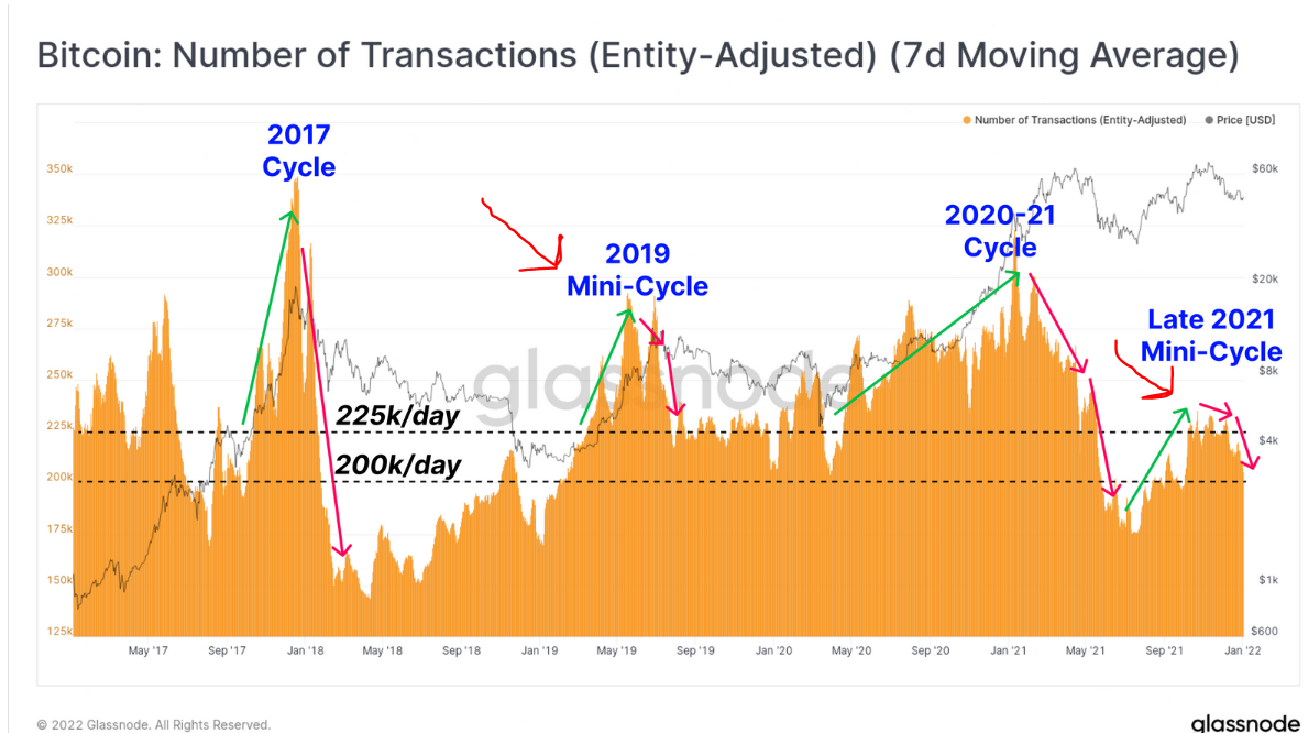
Another indicator is the number of transactions. Again, although there has been an upward trend-specific rise (in orange) recently, these rises are quite far from the 2017 and 2020-21 periods. Although Bitcoin has visited the $60,000 level (previously ATH) again, it has not aroused enough interest in the market. We can see this in the two indicators I gave above. So, our last visit over $60,000 looks more like the mini bull of 2019.
Long-term Buys
On the other hand, the behavior of long-term Bitcoin holders also gives us important information. As can be seen below, on Bitcoin’s first visit to the $60,000 level (i.e. as the price rises sharply with the new high), long-term investors start selling their holdings. What we usually see is that long-terms sell when the price goes up hard (bullish), and then when they start buying again, we see the price start to accumulate.
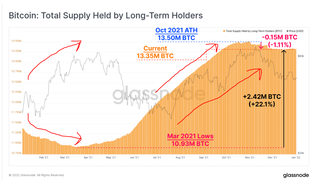
There is a similar structure here. Long-terms have started to buy and they are replacing what they have sold. However, long-term buying should not be too positive for you. Because we know that buying long-terms does not push the price up strongly. On the contrary, we see long-term sales when the price rises sharply. And we witness that long-terms buy when the price comes out of that strong rise and starts to go horizontal and when it is boring.
This period, when long-terms started to buy, shows us that the market will continue to be boring.
Death Cross Risk!
On the other hand, if we look at the relationship between the averages, we can understand why the Bitcoin price has not recovered recently. Below you can see the green average moving above and below the red average. The periods when the green average goes below the red average also show the periods when Bitcoin continues to decline. The periods when it rises are also the periods when the price creates an upward trend.
For now, the green average has turned its direction down. This triggers the behavior of investors to wait and see what happens instead of buying immediately. For this reason, volume and instability occur.
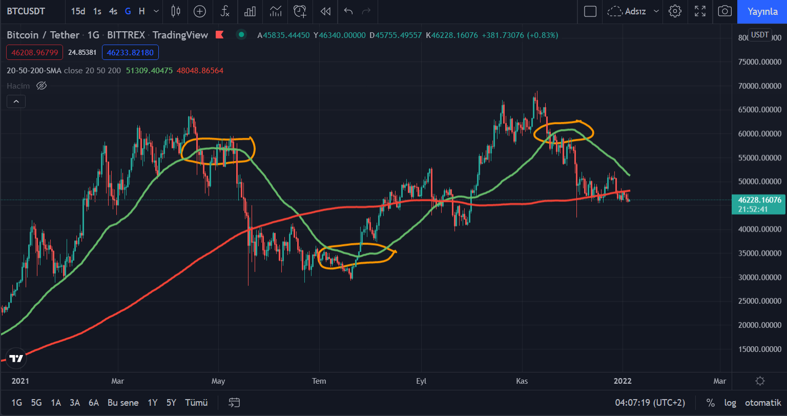
Also, Bitcoin’s second rejection from around $60,000 created a double top formation. It is useful to be careful on the side of Bitcoin, due to both some weaknesses we see in onchain data and the risk of “Death Cross”. So what should we expect?
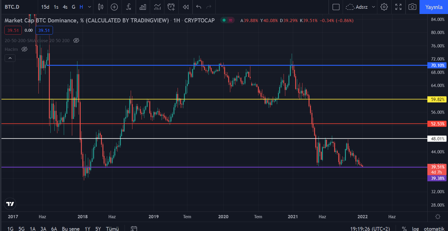
Above is the domination chart. We are currently testing the purple support level on this chart. BTC’s long-running no-volume movements are pushing the dominance down. For now, it is important whether there will be a reaction from the domination side. The continuation of the volumeless movements on the Bitcoin side may cause the purple support to be broken. And some altcoins may leave here lucky. However, it is also possible for the dominance to get a reaction from the support with a drastic move by BTC.
$BTC The 200-day average (pinkish) forms resistance. He’s trying to assign it. #BTC pic.twitter.com/996Nbbikzo
— Furkan Bozkurt (@BzkrtFrkn) January 3, 2022
In summary, a risk-averse investor behavior prevails in the market for now. For this reason, a boring and voluminous market dominates. In particular, it is important whether a drastic move will come on the Bitcoin side. There are some negativities and it is possible for these negativities to end with sales. The current weakness in the market, perhaps ending with some selling, will bring a safer market.
Disclaimer: What is written here is not investment advice. Cryptocurrency investments are high-risk investments. Every investment decision is under the individual’s own responsibility. Finally, Koinfinans and the author of this content cannot be held responsible for personal investment decisions.