Brands use many tactics to stay in the minds of consumers. One of these tactics is the choice of color. Let’s take a look at the meanings of colors and for what purpose they are used by which brands.
One of the most important things for brands is recognition. For this reason, in order to have a solid place in the mind of the consumer, their to the visual aspects they try to address. For this, the focus is on examining the effect of colors on perceptions, attitudes and behaviors. color psychology they use.
While designing their various elements, especially the logo, brands pay attention to the fact that they are compatible with the promises they offer to their consumers. The compatibility of the promises with the visual elements ensures that the brands remain in the minds of consumers by creating consistency. a stronger place causes them.
Each color has a different meaning and in our subconscious Considering that it evokes different emotions, the colors used by the brands for their marketing activities. didn’t choose by chance It wouldn’t be hard to say.
So let’s start with red, which is the color that stimulates the subconscious the most.
Red color; passionfire, desire, loveblood, power, anger, excitement, energy, bravery It symbolizes concepts such as danger and danger and stimulates these feelings in our subconscious.
In addition, the color red is known to increase one’s blood pressure and give energy. Because it reminds us of our physiological needs appetizing has an effect.
Why do brands use red?

sense of urgency awakening, symbolizing importance and draw attention It is preferred by brands.
Especially arousing appetite, It is frequently preferred in the food industry.
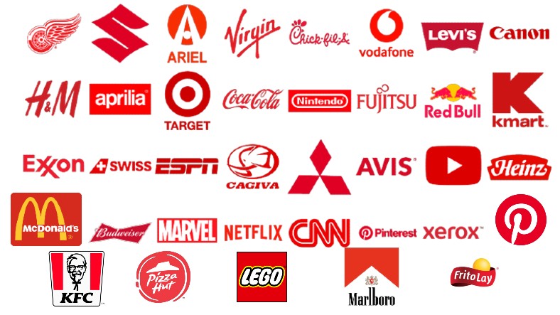
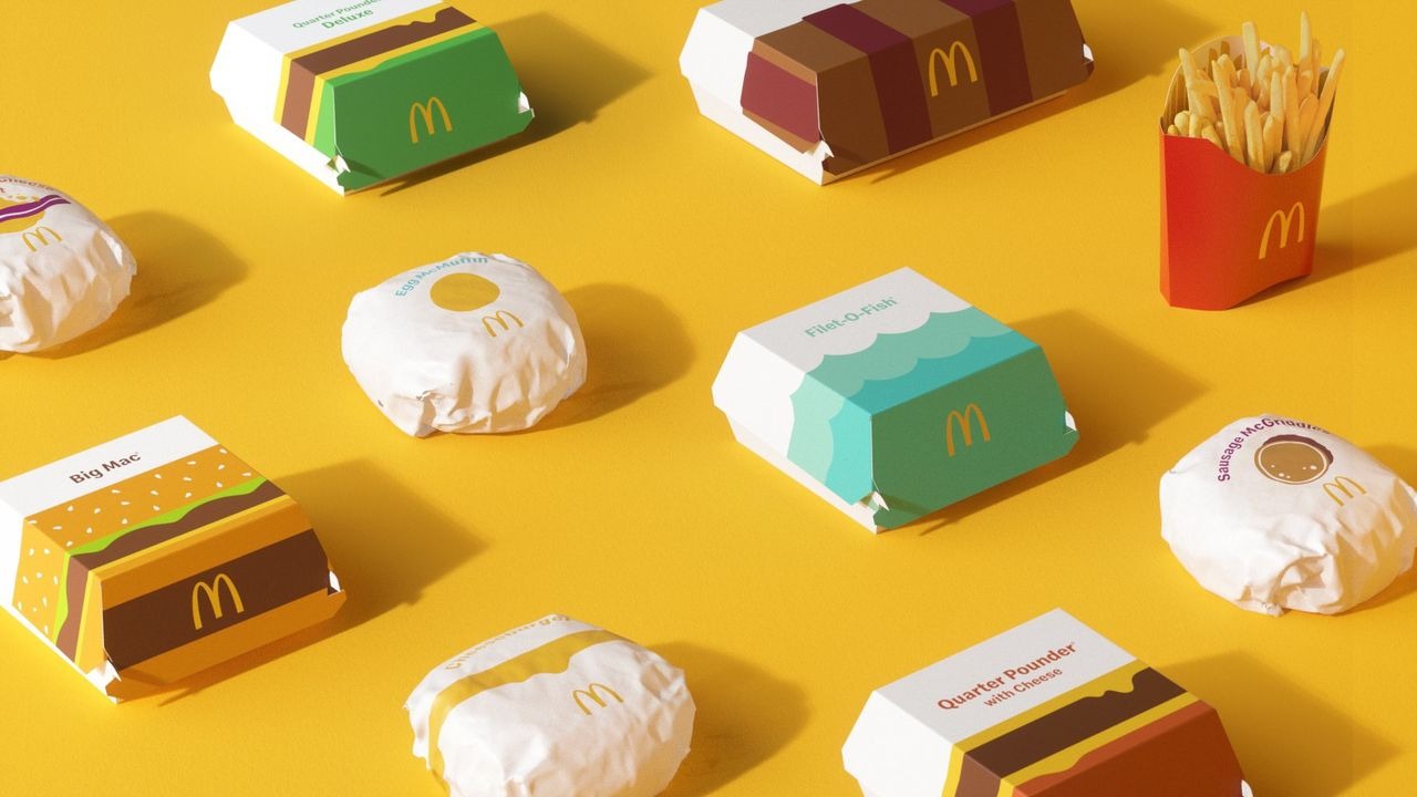
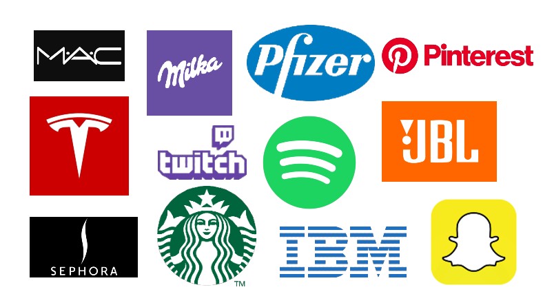
For example, brands such as Coca-Cola, McDonald’s, Pizza Hut, CNN, YouTube, Netflix prefer red color in their logos.
Orange, which is a combination of yellow and red, represents the strong features of both colors.
Orange color; enthusiasmenergy, excitement, assertiveness, friendlinesshappiness, optimism, extroversion and reflect the temperature.
Refreshing Because it is a color, it makes the person feel energetic and enthusiastic.
It is used by brands to encourage impulsive shopping due to its motivational nature.

For example, mostly orange color is preferred in e-commerce sites. It’s not a coincidence.
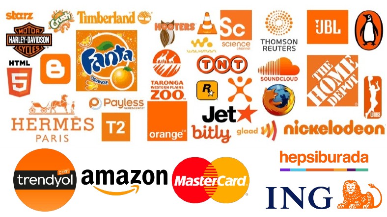
Among the brands that prefer the color orange, we see brands such as Trendyol, Hepsiburada, Amazon and JBL.
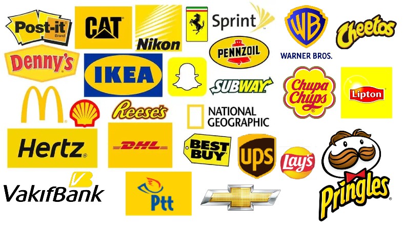
Yellow, symbolizing the sun and warmth, has an energizing effect.
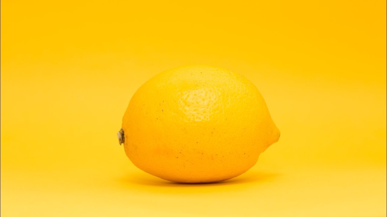
yellow color; light, hope, joy, optimism, awarenesscharm, friendliness, openness, youthIt means creativity, energy, ephemerality and curiosity.
In addition, the color yellow makes the person feel happy and sense of spontaneity It is known to awaken.
Yellow color is preferred by brands because of its attractiveness.
The color yellow is especially important because it awakens the mind and creates a sense of wonder. in showcases and packaging is used a lot.
In fast-food restaurants, red is used to appetize customers. for quick departure from the restaurant yellow is used.
Brands such as Snapchat, Nikon, IKEA, PTT Cargo prefer to use yellow in their logos.
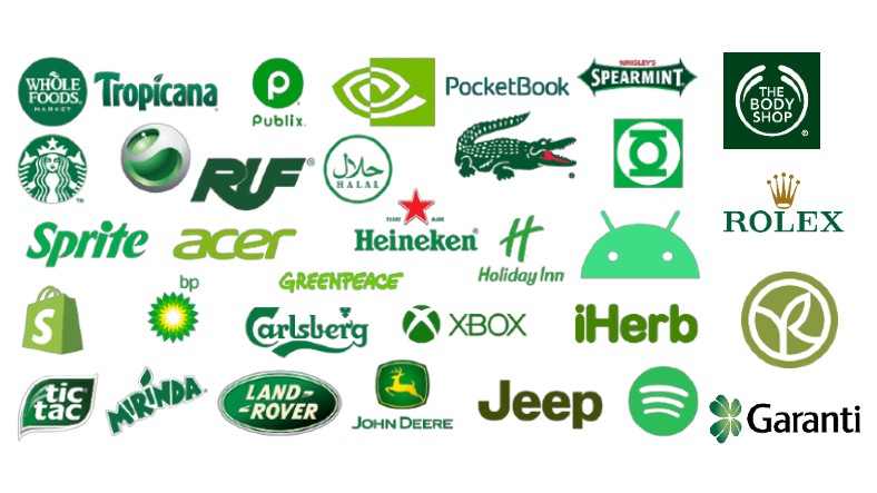
The green color, which is the symbol of nature, creates a dynamic perception in the subconscious.
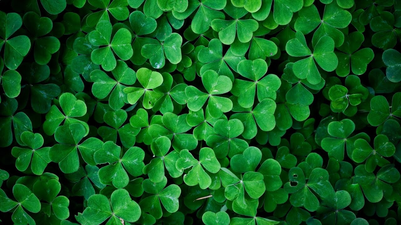
Green; development, wealth, hope, healthsymbolizes concepts such as peace, conservatism, naturalness and trust. Darker shades of green represent more wealth, status and prestige.
As it is usually associated with nature, optimistic feelings It also creates a relaxing perception by awakening it.
It is frequently preferred by organic and nature-friendly brands.
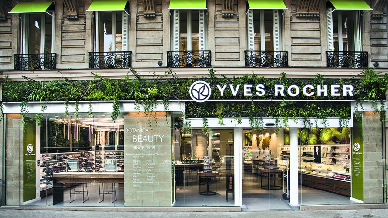
Yves Rocher or The Body Shop Eco-friendly brands such as nature-friendly brands often prefer green to emphasize their sensitivity to the environment and instill feelings of peace.
In addition, luxury brands such as Rolex prestige We see that he prefers dark green in order to encourage his perception.
Brands such as Starbucks, Garanti Bank, Rolex, Lacoste use the green color in their logos.
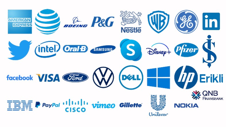
Blue, the color of the sky and the sea, has a relaxing effect.

Blue color; cold, calmcleanliness, tranquility, reliabilitysincerity, loyalty, wisdomIt symbolizes concepts such as authority, success, professionalism, eternity and honesty.
Light blue, with its evocation of the feeling of cleanliness and coolness cleaning and beverage brands frequently used by
Dark blue symbolizes more seriousness, reliability and power. Therefore in the financial sector is highly preferred.
Brands prefer blue to create the “trusted” image.
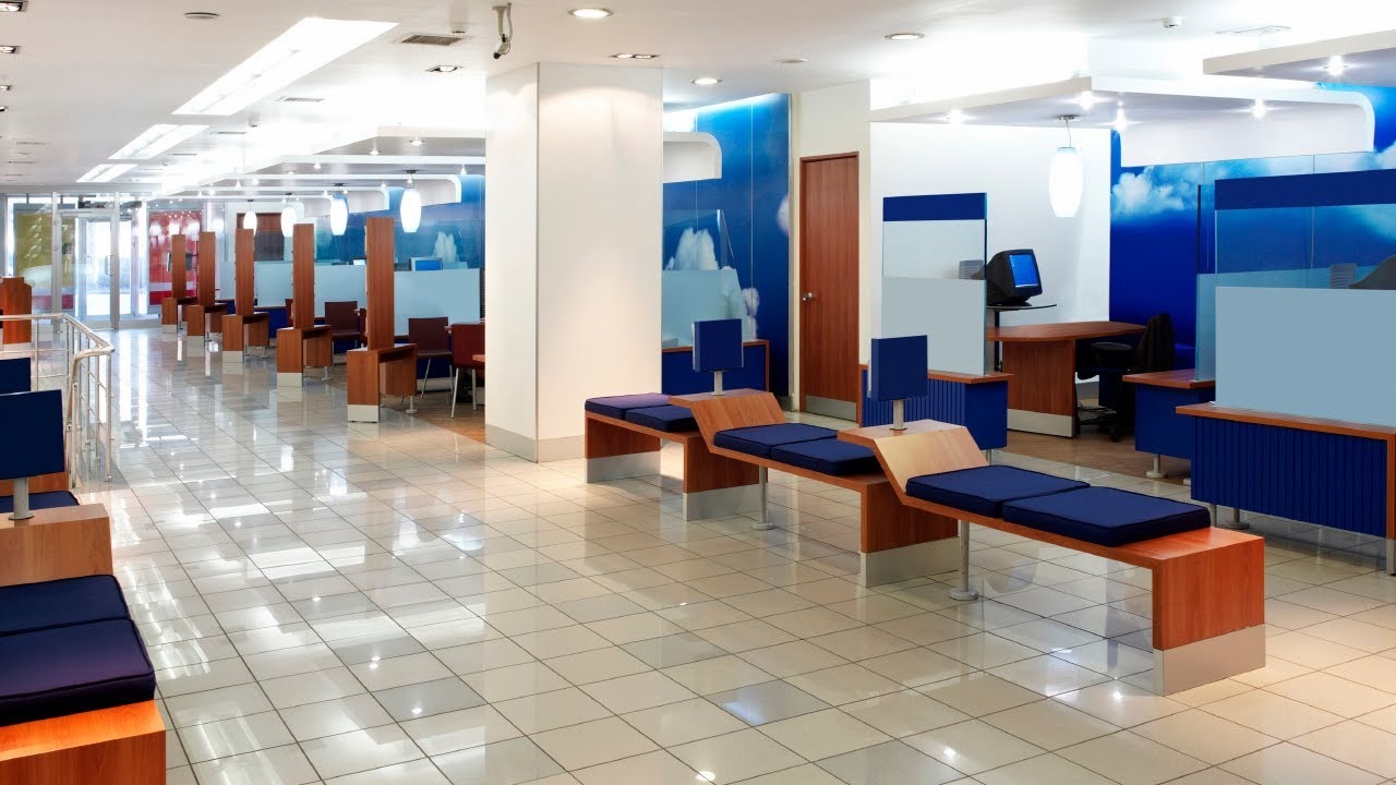
By using this color, brands are generally subconscious of consumers. success, quality, durability and trust tries to evoke concepts such as For this reason, it is frequently used in official institutions, banking, technology and similar sectors.
Moreover for increasing efficiency Blue color is often preferred in offices.
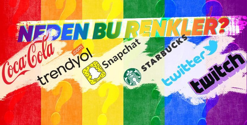
We see that brands such as Twitter, Facebook, LinkedIn, Samsung, İşbank, and Pfizer prefer blue in their logos.
The distinguished color that takes the passion of red and the determination of blue: Purple!
purple color nobility, mystery, prestige, luxury, prestige, royalty, success, creativity, wealth, elegance and wisdom.
Light shades like lilac whereas calm used to create.
It is preferred by brands that want to be remembered as a creative brand.
luxury brands He often uses purple to create a sense of nobility and prestige.
Due to the concentration enhancer education related brands is also used by
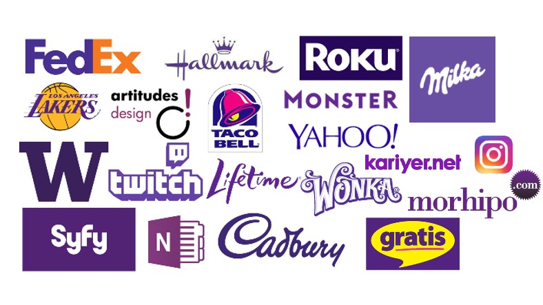
Brands such as Instagram, Milka, Twitch and Yahoo also prefer purple.
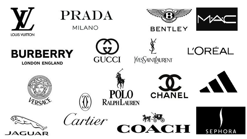
Color of authority: Black.

Black color; power, prestige and passion, mourning, mystery and control. It is a stylish and striking color.
It creates the image of fearless and brave. Therefore authoritative It is often preferred by people.
Black color causes the price perception to increase.

Elite customer segment Targeting brands generally prefer black color.
fashion and cosmetics Black color is often used in the sectors.
Luxury brands generally prefer black in their logos.
The color of minimalism and simplicity: White.

White color; cleanliness, purityIt symbolizes concepts such as virtue, impartiality, clarity, stability and simplicity.
Because it is a bright color calm It has a giving effect.
Brands generally prefer white color to create contrast.
White color, for logos to stand out It is usually used with different colors. In addition, the use of white color in the logo is mostly stability It is preferred to create a perception.
The white color is used in most of the logos.
As you can see, nothing about brands no coincidence. Which brand do you think used colors most successfully?
RELATED NEWS
Named Vehicles with the Same Names Although Different Brands: Even Sports Cars and Caravans Are The Same…
RELATED NEWS