Many of us do not like sudden and radical changes. Even if it’s the website interface. For example, how sad we were when X’s (Twitter) “favorite” button was changed. Users had gotten used to eBay’s old, yellow color, and when the company changed this color, they were flooded with complaints. eBay tried a different strategy for this and virtually conducted a psychology test.
Changing our behavior is not easy. We can make new decisions every year, every month, even every day, but how many of them can we implement? In short, We don’t like change very much and stick to our comfort zone and habits. It feels safer.
Whether you think about this through a lover or a website. Of course, we will talk about the website one shortly. Let’s see eBay’s strategy to manipulate user behavior What interesting results did it lead to?
eBay has learned through experience that users do not like sudden and drastic changes.
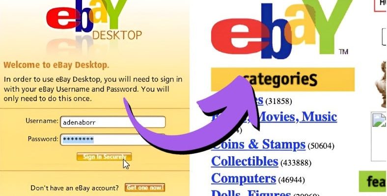
eBay’s website was bright yellow. It sounds strange, but users were used to it and didn’t find it strange. While other sites are white, eBay’s stuck in yellow It annoyed the eBay team.
One day, they made their background white. Guess what? From users, They received e-mails complaining that they didn’t like the color of the site! They were demanding the return of the old color.
eBay decided to try a different strategy.
eBay, which returned the site to its old color after users’ complaints, gradually closed the background for several months. They slightly whitened its color. Until all the yellow color disappears. And guess what happened this time? Almost no users even noticed the change!
Reddit was born for the same reason.

Have you ever heard of the platform called “Digg”? The logo you see above was the previous version of reddit. Digg, which was re-established in 2012, was not even a rival to Reddit because people preferred Digg by far. But after a change they made, brought about the end of the platform.
With version 3.0, Digg’s user interface was changed all at once. Users are They did not like the design changes brought by the new update and started turning to reddit. That process gave birth to reddit. If you remember, a similar thing happened in the past months with the transition from X to Threads, but X’s throne was not overthrown and we returned to it again.
Platforms like Yahoo and Amazon have implemented similar strategies.
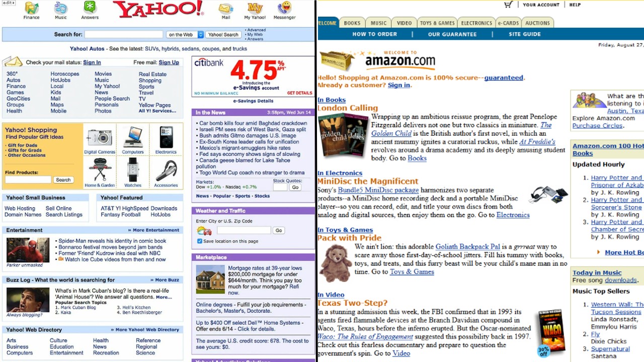
When you look at Amazon’s website, you might think it hasn’t changed at all since the early 2000s, but added every month There are many new features. Since they make the changes gradually, they are barely noticeable.
RELATED NEWS
Why Does Amazon Make Our Eyes Bleed With Its Site Design, Even Though It Is A Giant Brand?
Yahoo also redesigned its homepage, but the rest of the site remained the same for a while. After some time, they updated their mail service with a new look. A few weeks later, innovations came to the “Movies” section. So over time entire site It actually changed.
All these examples show us that a change should be made gradually, perhaps even by surveying users about their satisfaction, before making sharp changes. However, as we see from the eBay example Even if they don’t ask us, we won’t notice the change when we take it in small doses. We have seen!
Our other content that may interest you:
RELATED NEWS
The Defeated Wrestler Can’t Get Enough of Wrestling They Say: Yahoo’s Story Full of Failures, Shooting Its Own Foot in the Foot Every Time
RELATED NEWS
How Did Amazon Become the ‘World’s Most Valuable’ Company Again?
RELATED NEWS