In September, YouTube Music redesigned its Now Playing interface, rearranging basic controls into a carousel and making various user interface adjustments.
YouTube Music is now testing another visual update: Gradient background
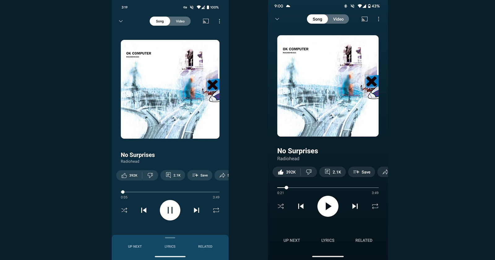
Currently, YouTube Music uses a solid color background derived from the album art when in Now Playing mode. The new feature includes a gradient background that transitions from a more vibrant tone at the top to a darker tone towards the bottom.
While Google has opted to omit more subdued tones in the past to ensure it complements album art, this new approach doesn’t represent a radical departure. However, the overall effect is a slightly darker background compared to the previous iteration.
The white buttons responsible for play/pause, track skip, shuffle and repeat commands now stand out more clearly on this new floor. Interestingly, items like “Next,” “Lyrics,” and “Related” no longer appear on a separate page, but instead float as gray text.

“What is the need for YouTube Music?” A new feature is coming that makes you say!
A new artificial intelligence-supported feature is coming to the digital music listening application YouTube Music. Here are the details…
This adjustment caused some users to feel that the buttons looked a bit disjointed without a defined button. Fortunately, although YouTube Music has eliminated the music library tab indicator, users can still swipe up from the bottom to conveniently access the queue.
While there are plenty of reports that this gradient Now Playing design has been tested on YouTube Music for Android, it hasn’t gone mainstream yet. The platform appears to be carefully evaluating user feedback and reactions before potentially making it a standard feature for all users.
What are you thinking? Please don’t forget to share your thoughts with us in the comments.