NASA has released a video that shows how carbon emissions are region by region. The images reveal the change in carbon dioxide emissions in 2021 in one year.
NASA has released some pretty scary videos on this topic as climate changes continue to threaten Earth’s future. Images that show carbon emissions as if they are really visible reveal the dire situation.
Three videos featuring all the continents were released by NASA’s Scientific Visualization Studio. In the images, one of the causes of climate change is a greenhouse gas. of carbon dioxide (CO2), mostly showing where it was released and how it changed over the course of a year. Orange is used for fossil fuels, red for burning biomass, green for land ecosystems and blue for oceans. Let’s add that the study shows the CO2 released during the year 2021.
The dominance of fossil fuels in the Americas, especially in the USA, draws attention.
In the first video we see North and South America. In the beginning, the most prominent part of the pollution was in the US cities such as Washington DC and Boston. northeast appears as. The part of the Amazon rainforest is green because the trees absorb carbon during the day.
But they release this carbon as the year progresses and the growing season completes and winter comes. From the video, we can also see how dominant the orange color is. Image, charcoal etc. It serves as a reminder of the colossal effects of using resources.
Video featuring Asia and Australia shows excess fossil fuel emissions from China
In the second video, we see Asia and Australia. Here throughout 2021 of china It can be seen that CO2 contributes greatly to the increased atmospheric load. It can be said that Beijing especially stands out in terms of pollution.
Although Australia seems more innocent in terms of orange than upper Asia, it is not. Because the country was announced as the place with the highest coal emissions per capita in the world in 2021.
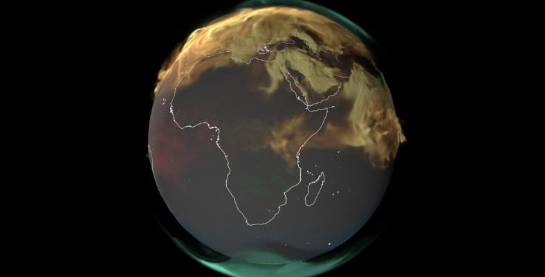
The carbon emissions in Europe, the Middle East and Africa in 1 year are as follows:
The final video features Europe, the Middle East and Africa. The images show the excess of fossil fuel emissions from European countries and Saudi Arabia.
NASA’s videos can play an important role in raising awareness, as they are an indication of what we are facing. These are all harbingers of more extreme and frequent heat waves, floods, storms, devastating effects on wildlife and many more serious risks.