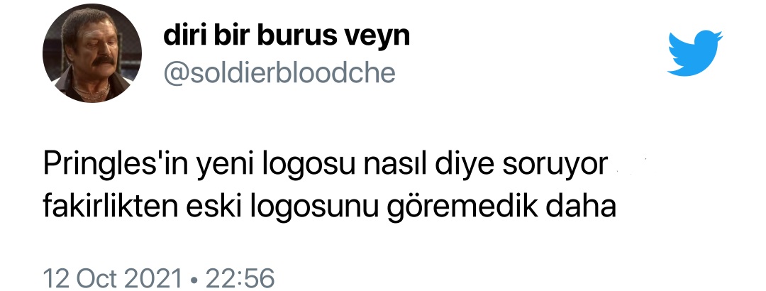
The logo change announced by the world-famous chips brand Pringles in 2020 became the agenda on social media today. Users shared entertaining posts on the subject.
One of the world’s largest potato chip brands. Pringlesannounced that it would change its logo in a statement on December 31, 2020. This was an important development because the company had decided to abandon the logo it had used for decades. This event, which has been known for months, is now became a hot topic on the internet. Users are divided into two because of the new logo.
It is a well-known fact that in recent years, a more modern and simple logo has been used. This is Pringles keeping up with the trend It was one of the companies. In the statements made on the subject, it was stated that the new logo was found to be more youthful and eye-catching. In addition, the company’s new logo in emoji style he wanted it to be. Social media users, who have just learned about the change in the logo, have started to make this development viral.
This is what Pringles’ new logo looks like
You can see the old logo on the left and the new logo on the right.
To be frank, the new logo is a direct hit with some users. to hate led to Some users stated that this logo is quite cute. If you wish, without further ado, users can support this logo change. how they react Let’s see together…
This is what Pringles’ new boxes will look like
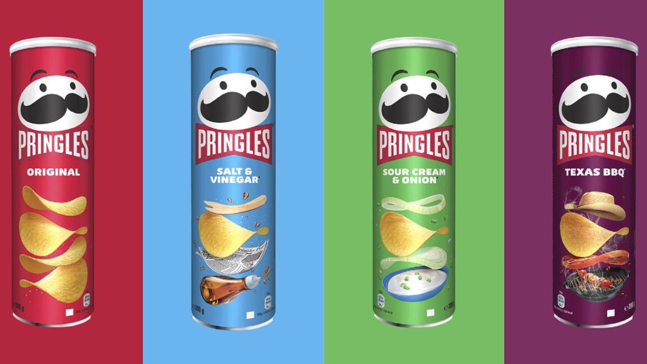
So what are your views on this? How did you find Pringles’ new box? You can share your ideas with us…