People no longer remember brands by their names, but by their visuals. That’s why brands, companies and even government organizations attach great importance to the logo. However, there are such logos in Turkey that it would be an understatement to call them bad.
Logos, which are the visible face of the brands, are the most important point of the first contact with the user. The most catchy and beautiful logos are usually creative ideas It is designed in light.
However Not every memorable logo is good. As in the rest of the world, there are people who are remembered with their bad designs in our country. Let’s take a closer look at the badly designed logos in Turkey.
It was as if it was made by a relative saying ‘you can understand the computer, my nephew’.
Homeland Party’s logo It was first announced that it would look like the image above, and the logo had not fallen off the agenda for a long time.
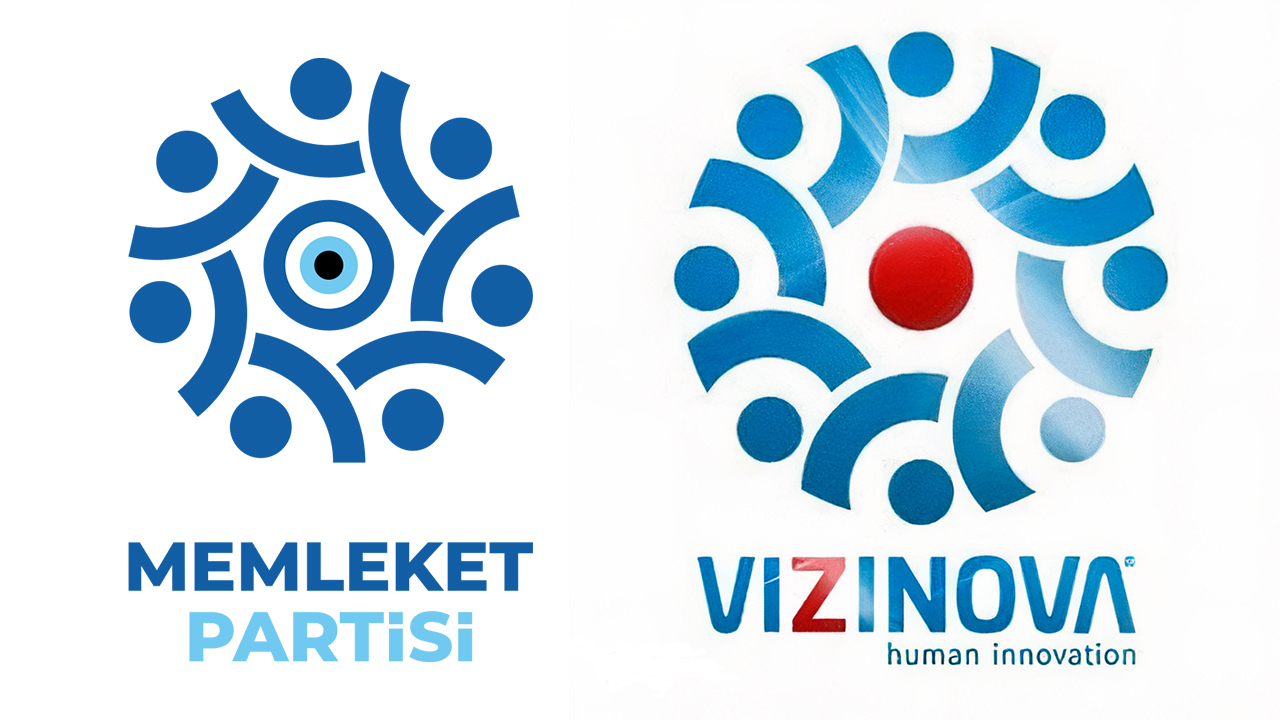
After the reactions, the logo of the party took the form above. But as you can see above, the logo is similar to the one on the right this time. with alleged stolen remained on the agenda for a long time.
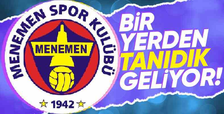
They said, “There is no Fenerbahçe in İzmir, we will establish it”.
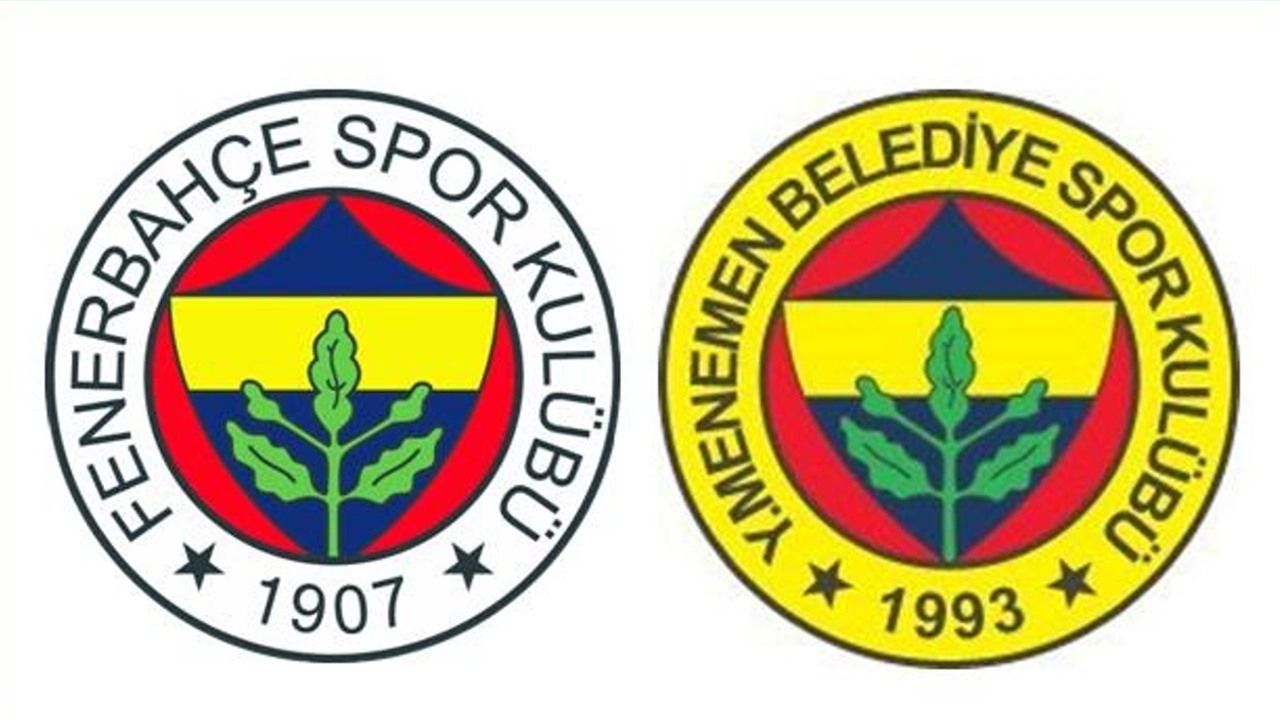
Founded in the Menemen district of Izmir, Menemen Football Club has been known for years with its logo, which is the same as Fenerbahçe’s logo. While establishing the club, the founders of the club were fans of Fenerbahce. same as coat of arms they wanted it.
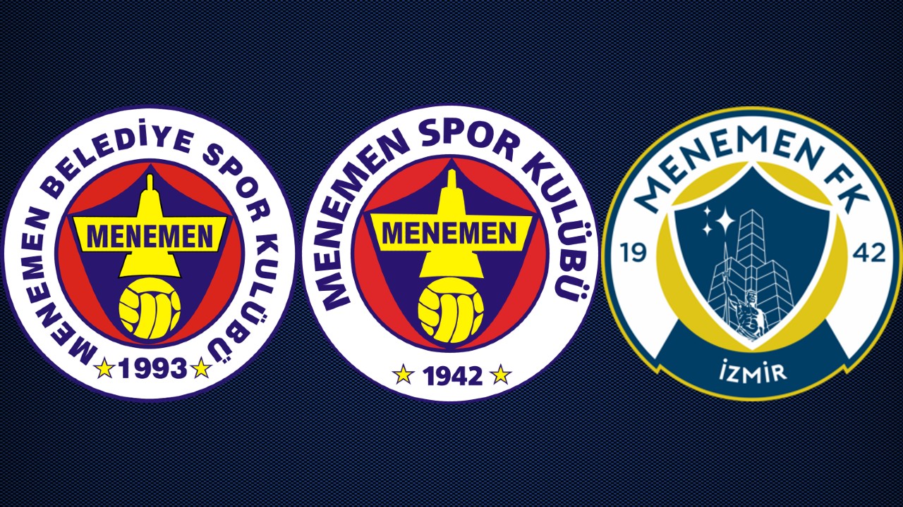
As you can see in the photo, the club’s logo and name have changed over time, but Fenerbahce’s logo has changed. The similarity continued.
Ankara residents sued the cat(!)
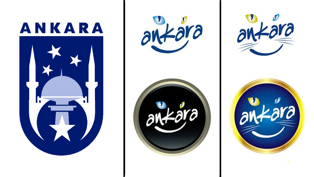
While Melih Gökçek was the mayor of Ankara Metropolitan Municipality, he changed the capital’s logo and this logo caused great reactions. In fact, the people of Ankara did not like the cat logos so much that a lawsuit was filed to change it and all the designed logos were removed.
It’s Togg’s first logo that doesn’t seem like much thought.
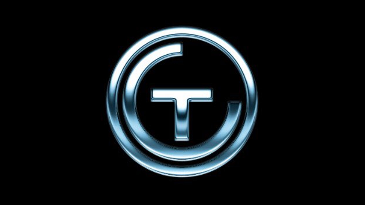
Everyone is eagerly waiting domestic car Togg each stage had a separate agenda. From the day it was first announced, various logo designs began to circulate on the internet. Initially, the design consisting of the letters T and C inside the gray circle became known as the official logo.
RELATED NEWS
What Does the Logo of the Domestic Car Mean?
However, it was announced last year that the design you see in the photo will be used as the official logo.
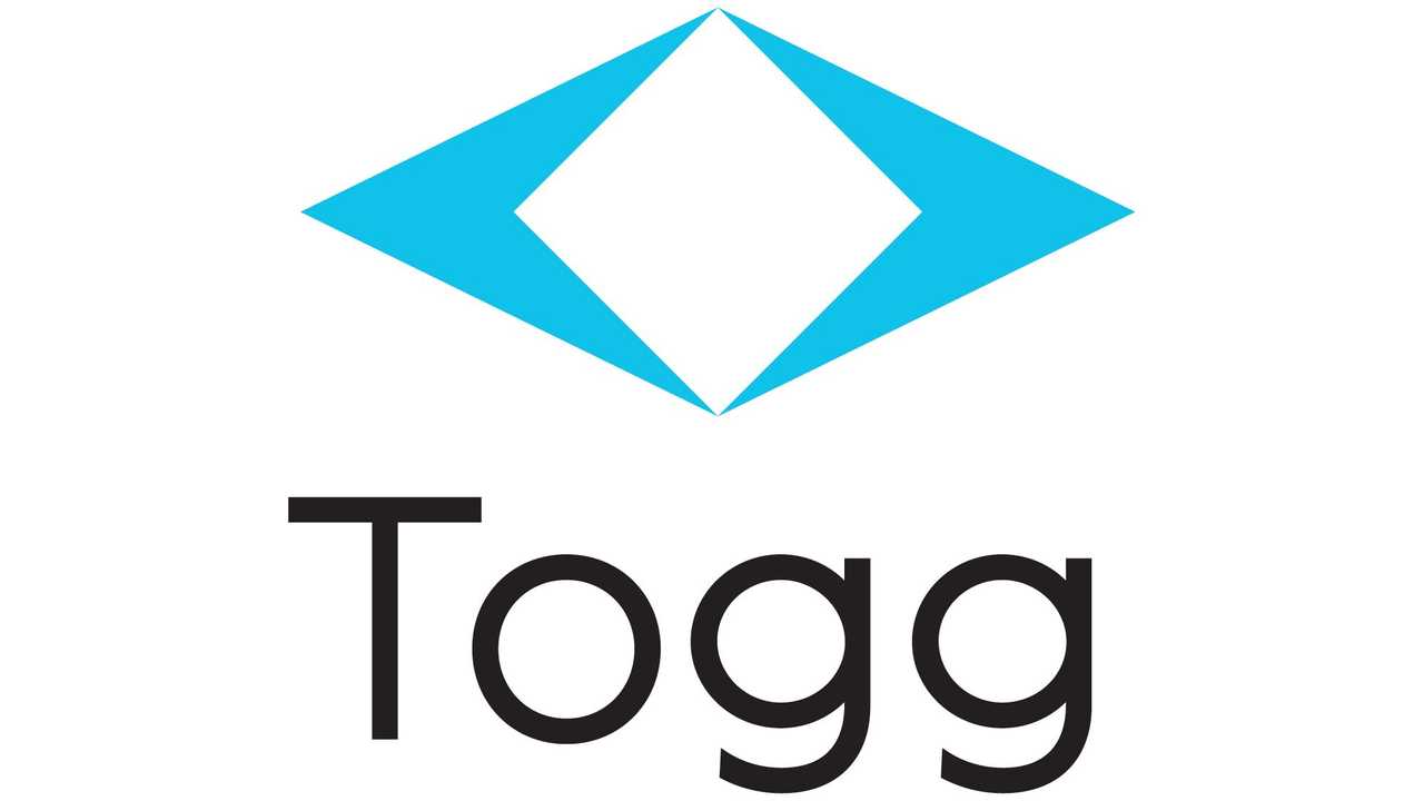
While this design is liked by some, it is also Hole It has been compared to many designs, from the famous three-point emblem of the series to Renault’s logo.
If we put Master Splinter, he can’t get out of this maze.
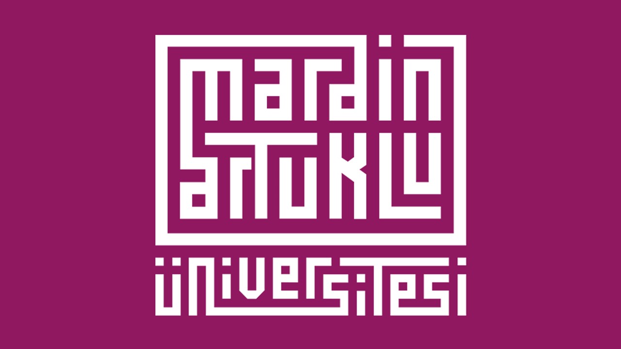
According to some Represents the narrow streets of Mardin According to some, the font was inspired by a font called kufi. We think the logo is too complicated.
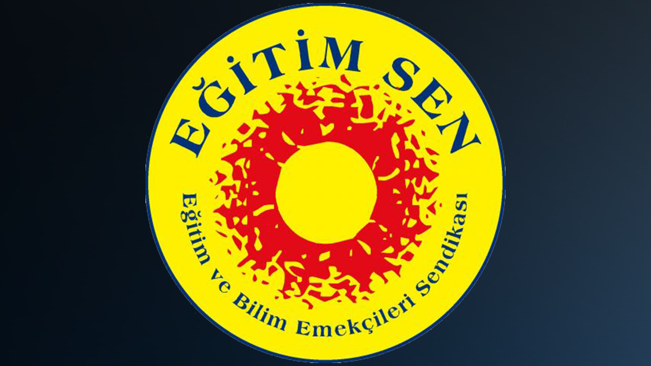
Preparing a logo using the letters İ, K, Ü on a red background? But that’s TWO.

The yellow round shape in the middle might be the Sun, we’re not sure. It doesn’t dazzle, it bleeds.
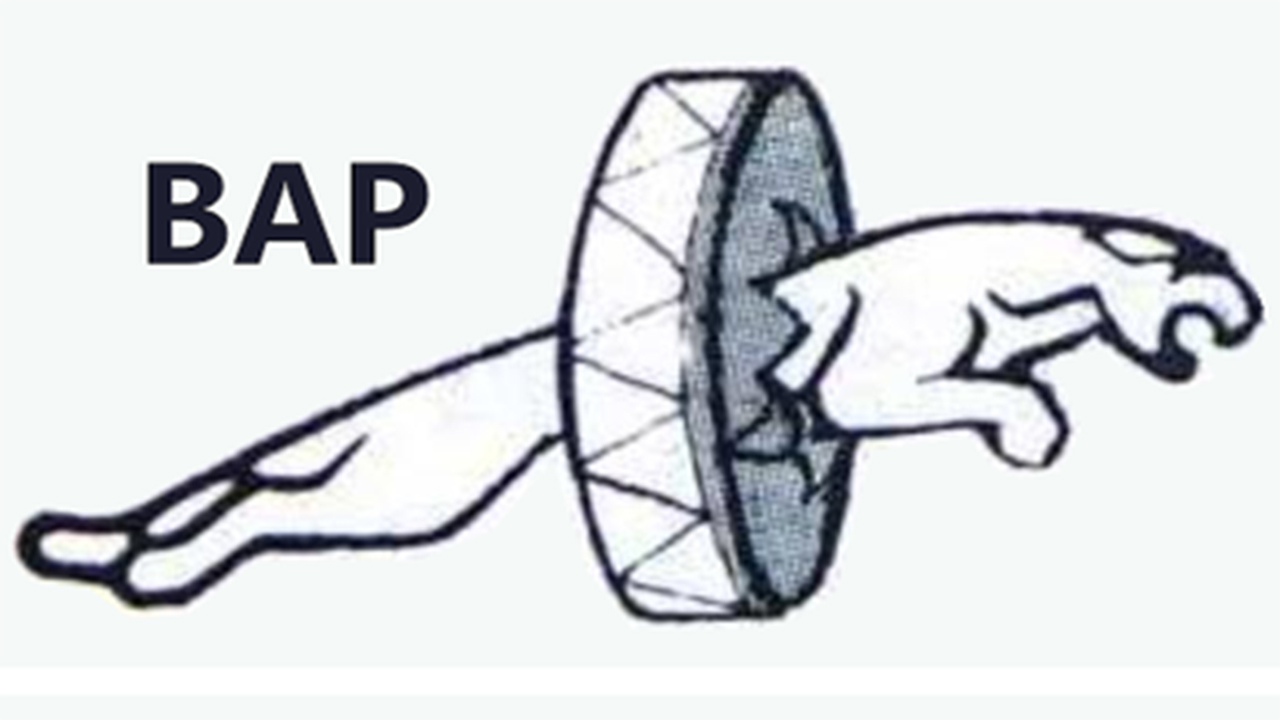
The jaguar that pierces the drum: The Great Anatolian Party
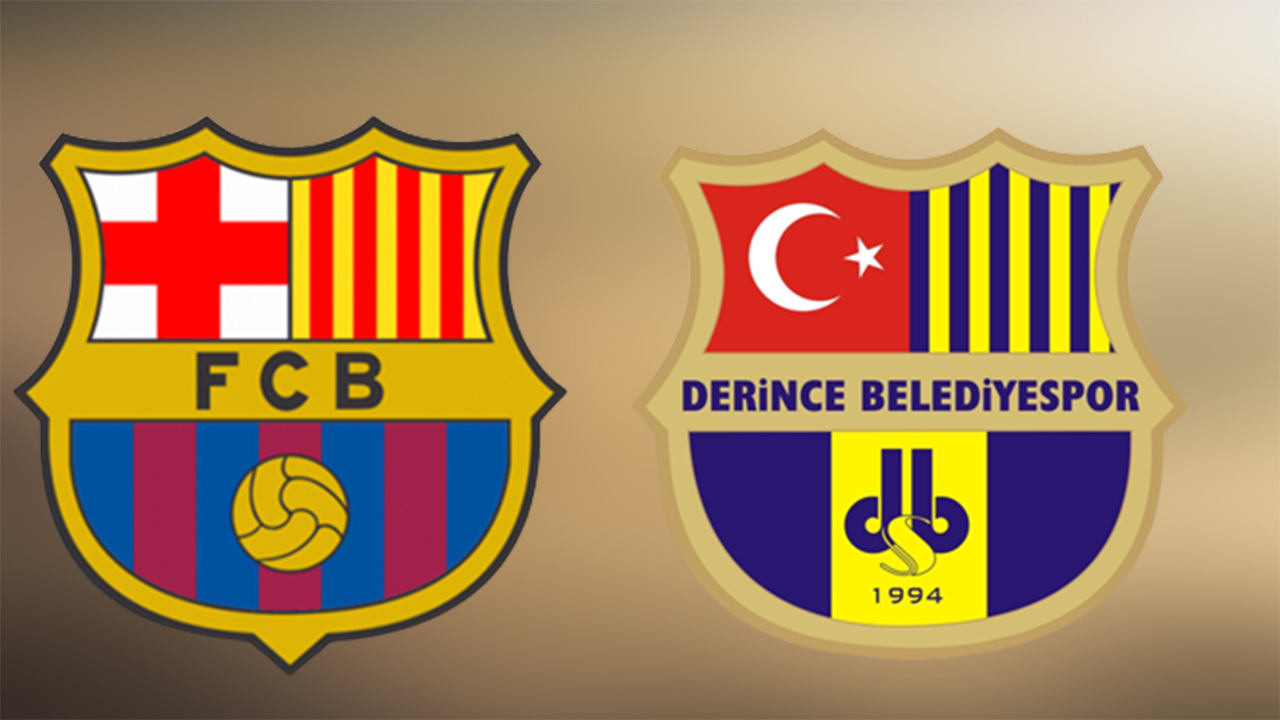
Why not a Barcelona in Turkey?
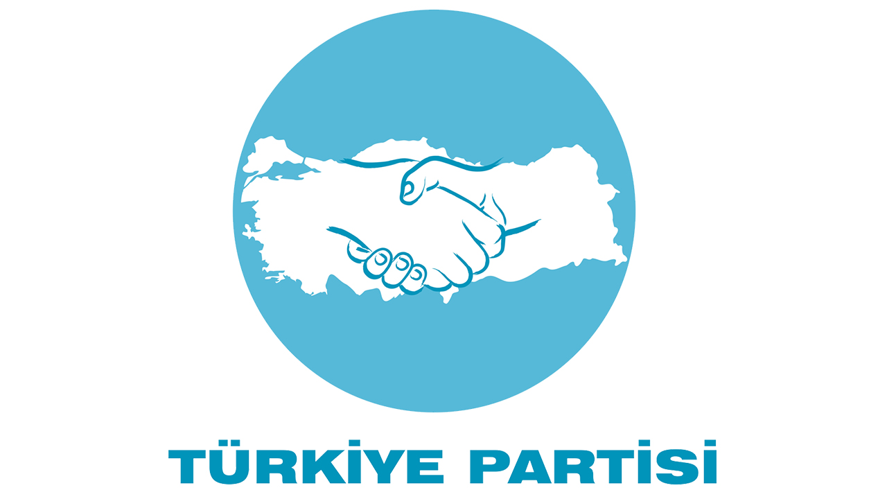
It can be proven by shaking hands that the products are local.
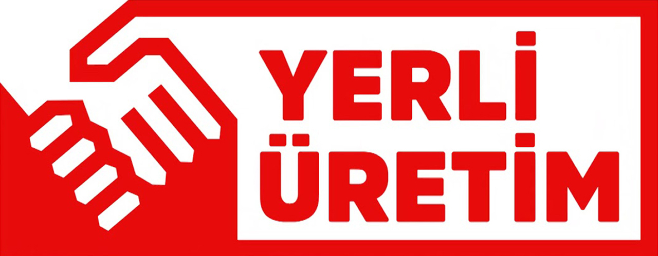
We did not know that we are a nation that loves shaking hands so much.
Sureyya Hanım has changed this time, but this logo looks familiar from somewhere.
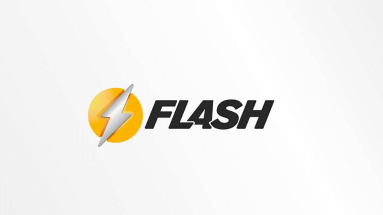
Renewed logo of the famous television channel Flash TV. Flash from DC Comics characters It looks very similar to the logo.
RELATED NEWS
Flash TV Ends Its Broadcast Life Once Again: Its Name and Logo Are Changing
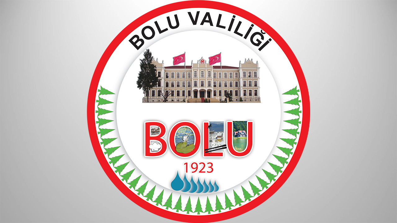
You forgot Köroğlu and Bolu Bey.
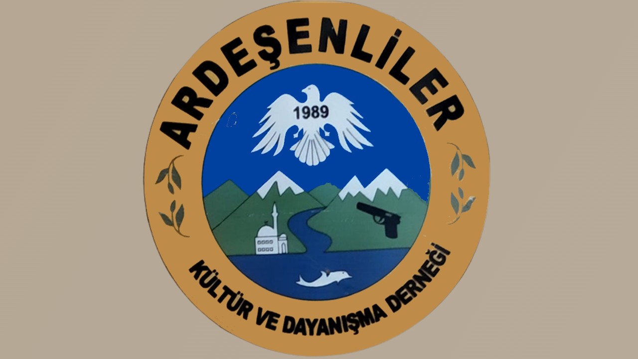
Culture, solidarity, weapons…
We have compiled badly designed logos in our country for you. What are the logos or logos that you do not like and that you think should definitely be on this list? Do not forget to indicate your ideas in the comments.
RELATED NEWS