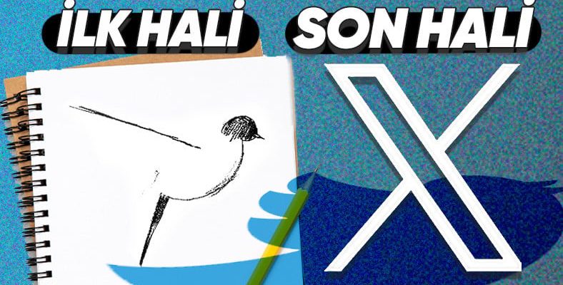
Twitter, which has been in our lives since 2006, does not look like Twitter anymore. As you know, Elon Musk, the richest person in the world, bought the platform and has been trying various things since the day he bought it.
One of the last mischief Musk did was chasing Twitter’s bird. The Twitter bird, which we have seen almost since its release, is now replaced by a huge with an italic “X” left.
Twitter’s logo and its famous bird have changed many times before. But a change as radical as Elon Musk’s it only happened once. Until today…
The first name given to Twitter was “Smssy” and its first unofficial logo was:
However, this name was changed before the app was released. The logo with the word “Twttr” that you have seen above Officially never used.
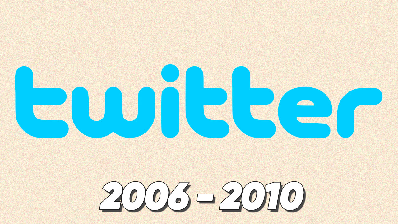
The first official logo, on the other hand, was a plain “Twitter” text created with the font we are all used to.
The company purchased a small light blue bird design from Designer Simon Oxley soon after it got its new Twitter logo. This bird logo, over time It was the first version of the bird that would become Twitter’s symbol:
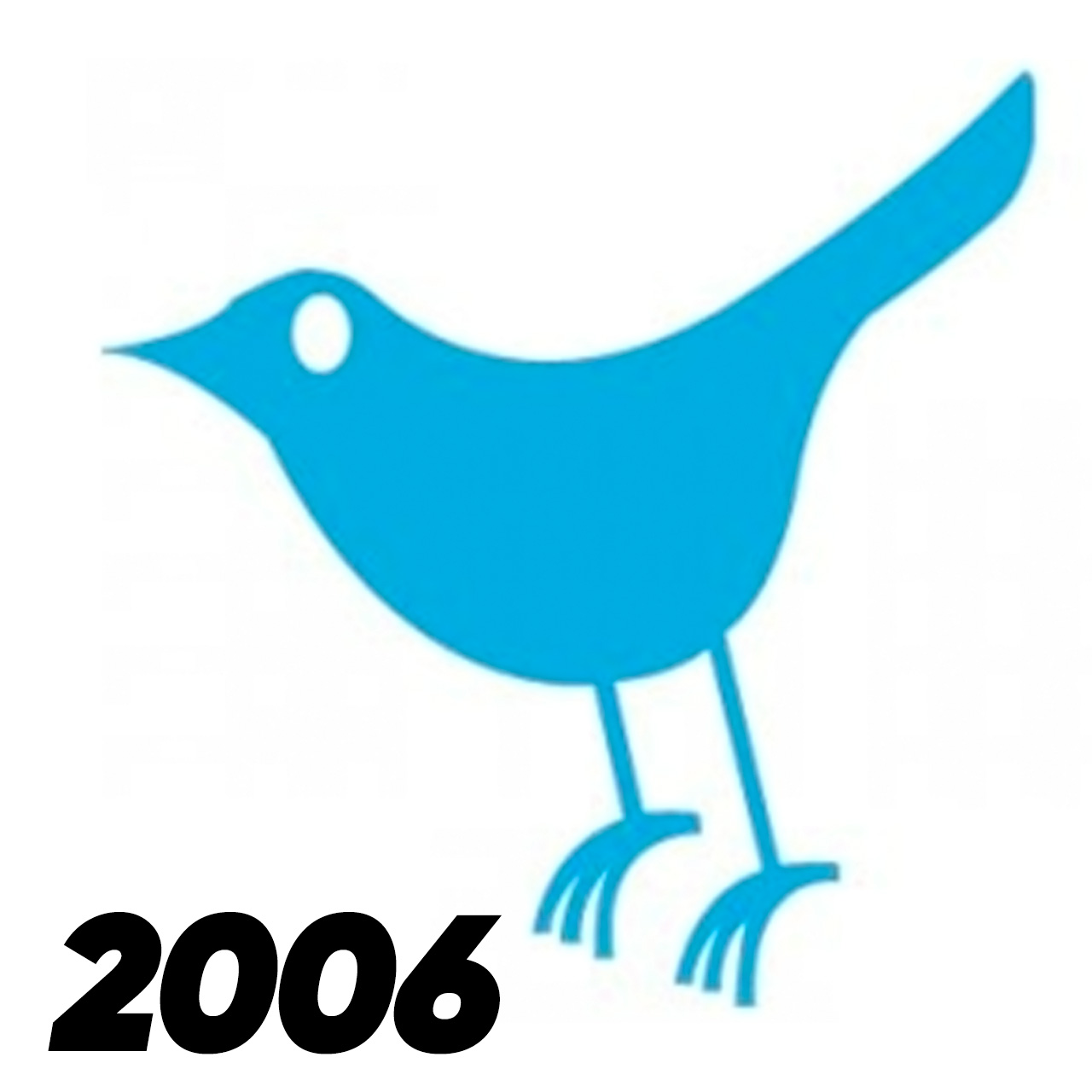
Its symbolic meaning is freedom.many times throughout history communication tool It seemed quite logical that Twitter’s symbol was also a “bird”, since they were used as However, this bird had another meaning. Larry Joe Bird, one of the star players of the NBAThe name “Larry” was given in his honor.
Although not included in the logo, the design of the bird named Larry was very important. It needed to eat a few more bakery breads to become a stand-alone logo one day. For this reason, it was redesigned first in 2007, then in 2009 and 2010.
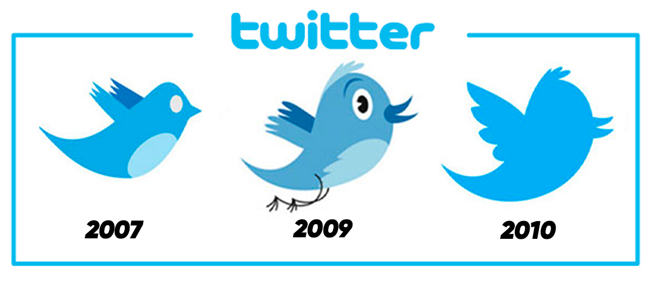
In the next logo, this time Larry was also present.
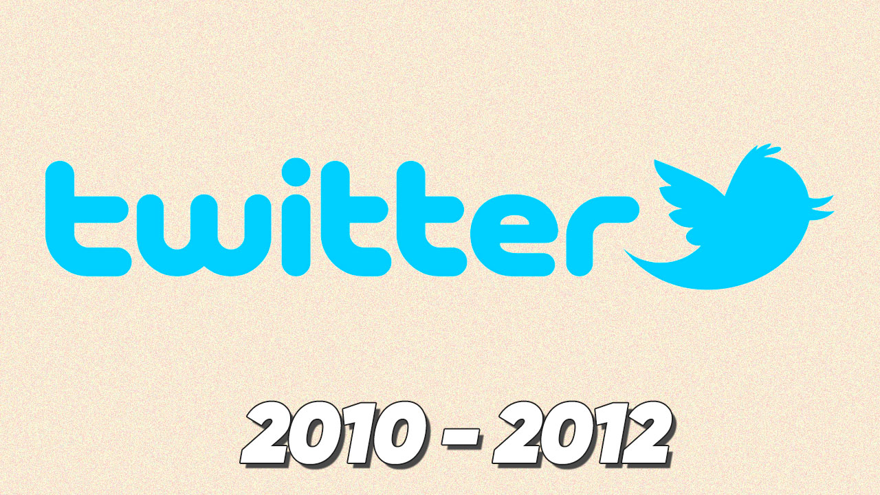
Twitter changed a few more designs before taking it to the final form we remember. The design you saw above, It was the platform’s logo from 2010 to 2012. As you may remember, the company name being written on the logo was a very famous trend. Nike, Pepsi, Starbucks and many more brands for a period of time It also included the brand name in its logo.
This is exactly what happened on Twitter. First the name of the platform, then both his name and symbol were included in the logo.
When we come to the final design, Only the bird remained in the logo.
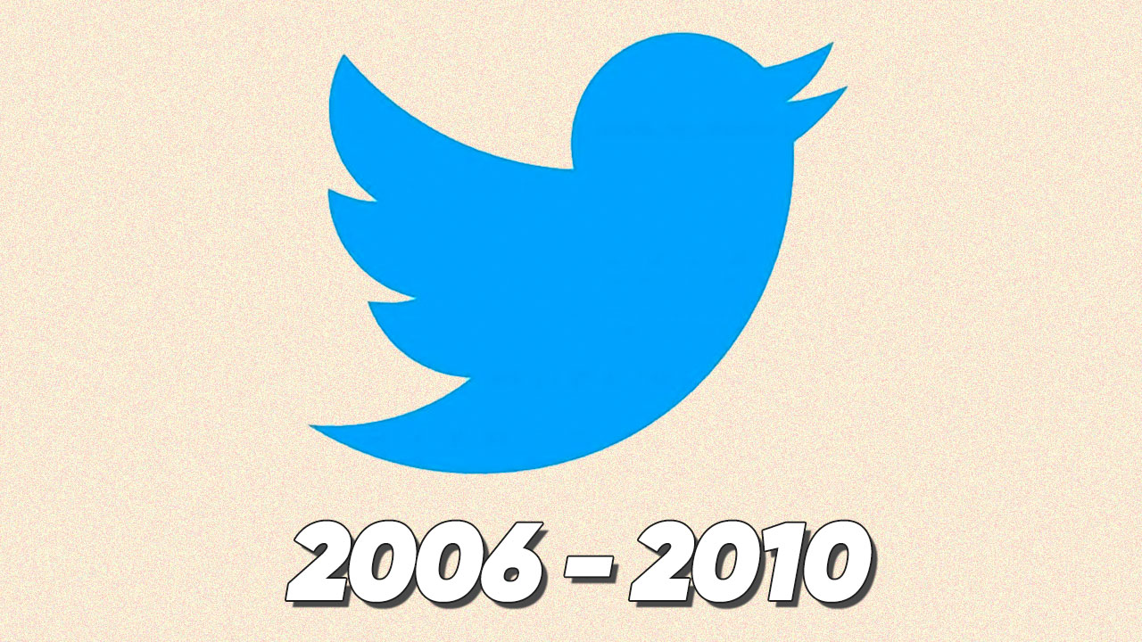
Moreover, the most birdlike bird ever was this last logo designed in 2012. On the other hand, Twitter’s last logo also underwent a name change and became “Larry the Bird”. The name has been updated to “Twitter Bird”.
Martin Grasser, one of the designers who designed Twitter’s iconic bird, both said goodbye to his design and explained how this design came about.
“Today, We say goodbye to this wonderful bird.
It was designed in 2012 by a small team of three: Todd Waterbury, Angy Che and Me.
The logo is designed to be simple, balanced and legible, with very small dimensions, almost like a small “a” or “e”.”
Martin Grasser continued to share more of Twitter’s previous bird design. looks like a “little accident” but he adds that Jack Dorsey wanted a simpler and more birdlike design. Therefore, the design team consisting of three people aimed to create a simple and perfect bird.
Here are the first sketches of Twitter’s logo, which will remain unchanged for 11 years:
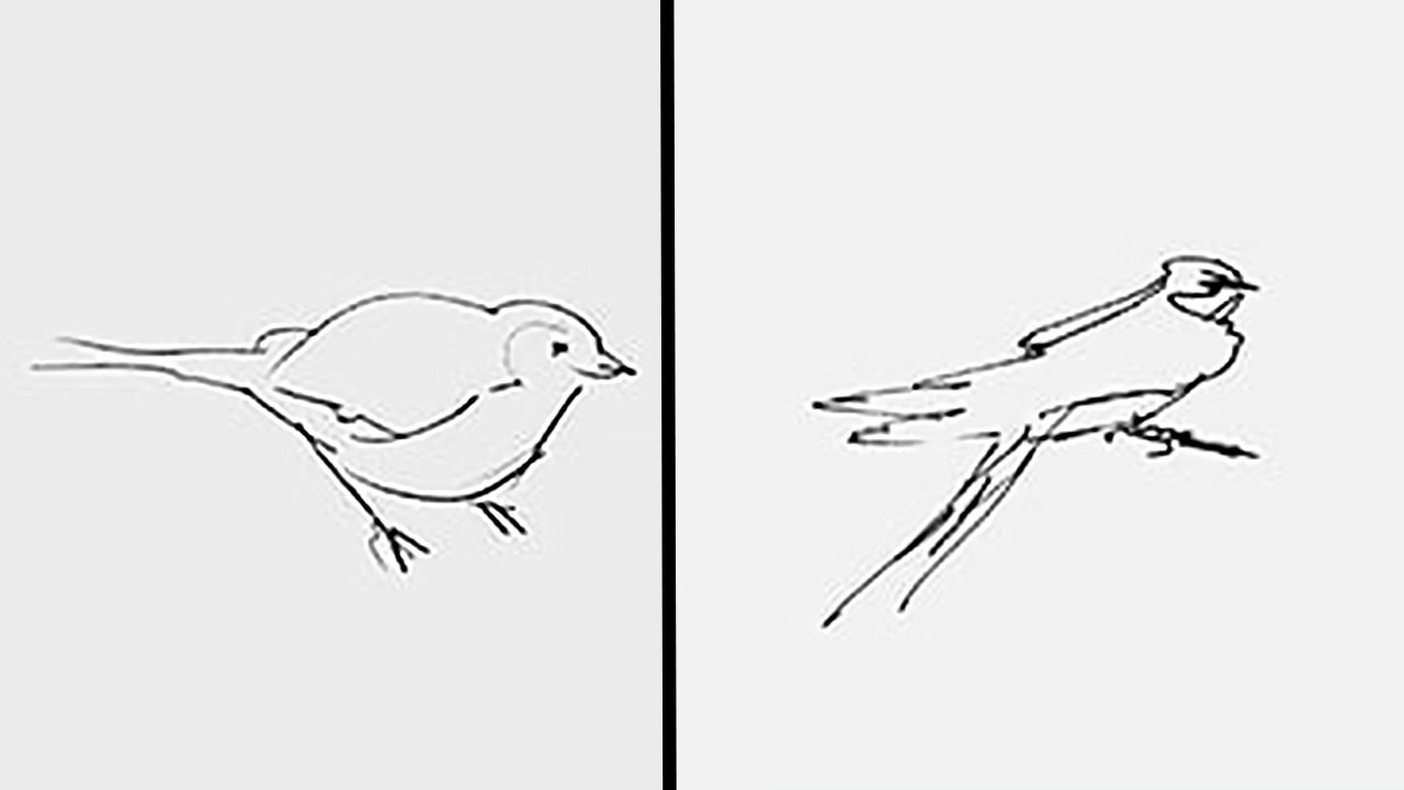
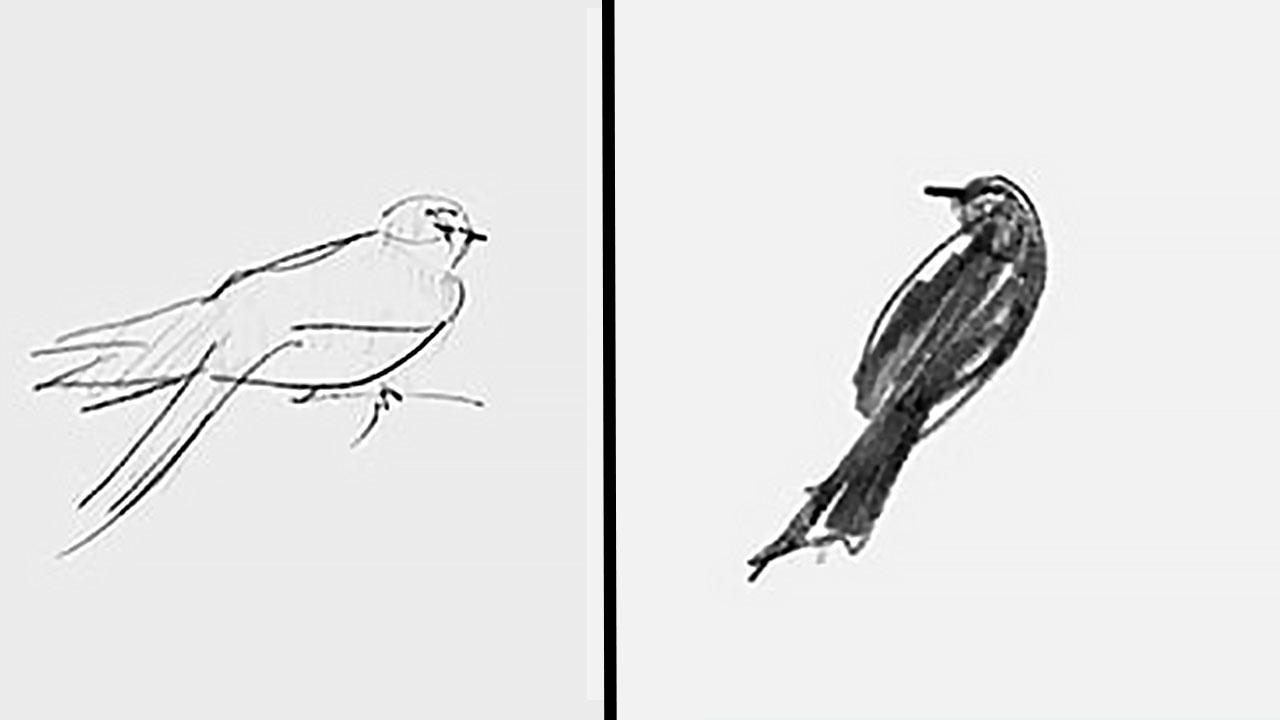
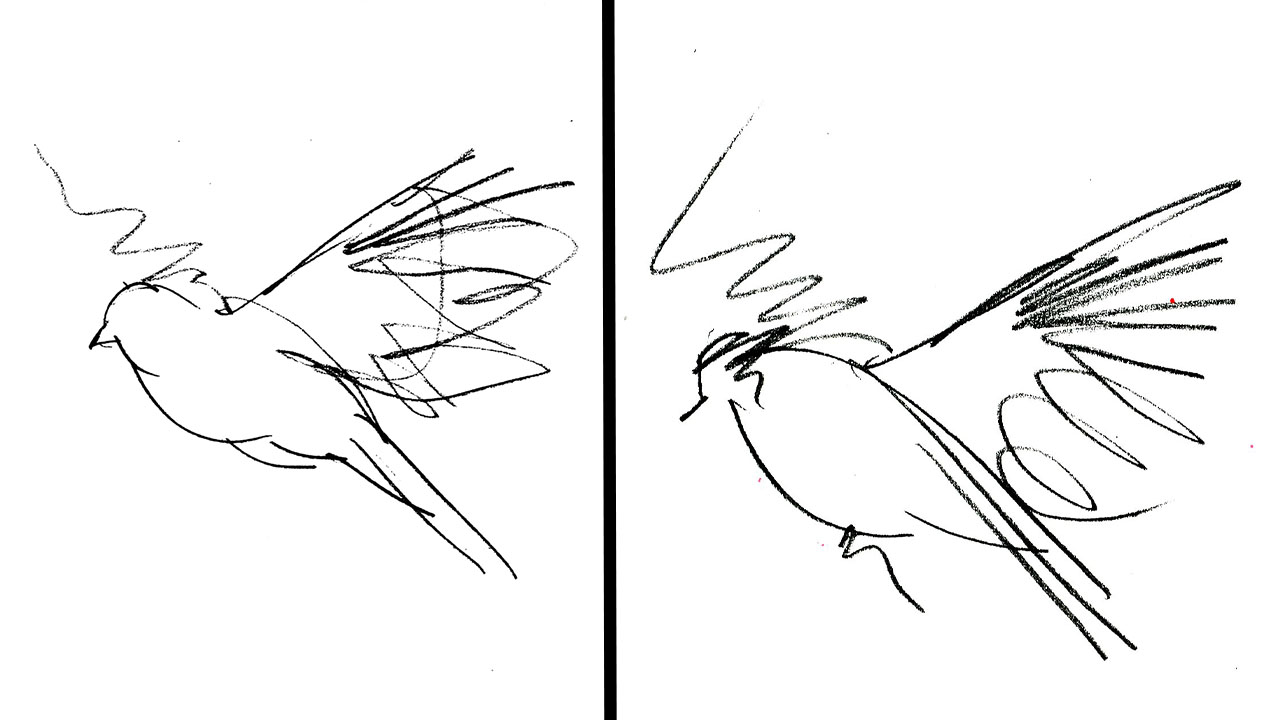
Before designing Twitter’s famous bird logo, Martin Grasser drew a lot of sketches. In the continuation of the post he made in the past days, this famous some of the first sketches where the logo appeared He shared it with his followers on Twitter.
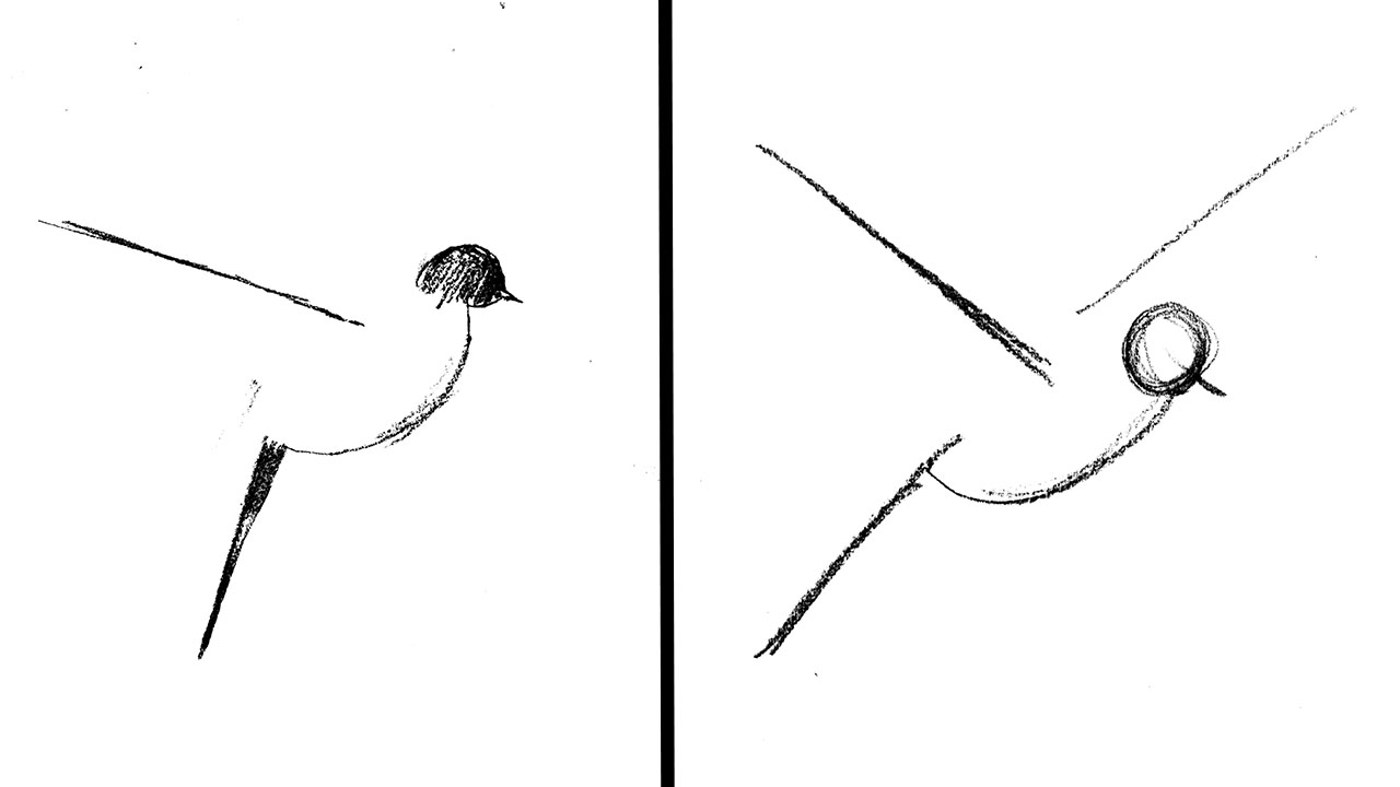
The last two of his sketches (above) inspired him for the final logo: a small, bulging belly and a side view of the bird. Twitter’s new bird was starting to emerge, but on all screens and in all sizes. able to look like a decent bird had to.
The design team is also like Pepsi and Apple; decided to create the logo using circles. Almost golden ratio The 15 circles formed were placed on top of each other and formed the entire body of the bird. Little blue bird with its head facing upwards, symbolizing freedom and communication, every little detail of which has been carefully designed. It has not made any changes to the logo for 11 years.
Until Elon Musk changes it, of course.
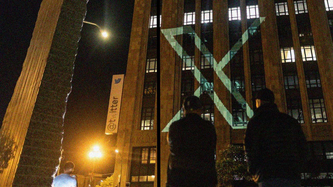
There were many reasons why Twitter had used the same logo for many years. The logo was almost perfectly aligned with the golden ratio, easy to understand, and had positive associations. Moreover, everyone knew it was the “Twitter Bird”. This is one of the greatest achievements a brand can achieve. However, Elon Musk changed this world-renowned logo and replaced it with the “X” symbol, garnering a great reaction. you know that he It just doesn’t let go of the “X” symbol but we’ll have to wait and see if the letter X will also be auspicious on Twitter.
You can find the latest developments about Twitter’s new logo in the following content:
RELATED NEWS
Elon Musk Explains Why Twitter Changed Its Name
RELATED NEWS
You Have A Fight: Mark Zuckerberg Revealed That He Got The “X” Brand Before Elon Musk
RELATED NEWS
Elon Musk Requests New Artificial Intelligence Initiative X Logo From Twitter Followers
You can also check out our content about Elon Musk’s obsession with the “X” symbol:
RELATED NEWS