Although Google Chrome is a RAM monster, it is still the most used browser. This browser that we all use has undergone several logo changes over the years, and the last change has finally started to be offered to users.
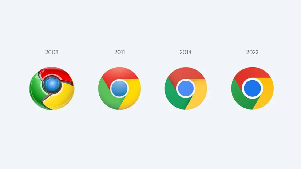
The logo of Google Chrome, which first appeared in 2008 and had a bright, three-dimensional and glamorous logo at that time, has remained until today. had changed three times. With the new Chrome update released today (Chrome 100), Chrome’s logo has experienced the fourth change in its history.
The first logo of Google Chrome, we are talking about like three-dimensional and it was a heavily illuminated logo. For those times, these elements were of course ‘Oh look how technological it looks‘ he was saying. Later logo in 2011 two-dimensional it took a turn and had lighting + shading. In the change of logo in 2014, Google, removed the lighting. But in this world order, where minimal designs continue to dominate, Chrome has now gotten rid of the shadows.
Removed shadows from Google Chrome logo
In the logo change of Google Chrome, which took place 8 years later, shadings also got up and we are left with a plain and simple logo. However, the logo remains the same in height, but in the middle with the growth of the blue circle together it had a thinner circle.
Besides the change in shadows and blue circle, Chrome, to more vibrant colors It also got a logo. Red, green, yellow and blue colors are now even more vivid with a very fine adjustment to the colors. The evolution of Google Chrome’s logo since its release has ended as follows: