Especially brands that have been operating for many years can renew their logos according to changing consumer behaviors and market dynamics over time. We have compiled the recent changes that brands have made in their logos for you.
There are many reasons why brands are engraved in our minds. Undoubtedly, the most important of these is the logos of the brands. One of the most important elements of the branding strategy One of them, logos, serve to increase the recognition and awareness of brands.
Just as there are developments in the world over time, these are also reflected in the behavior of consumers. Brands also use their logos by taking into account the changing demands and perspectives of consumers. suitable for changing dynamics They make little touches to make it happen. Bride, what brands do in their logos to recent changes Let’s see together.
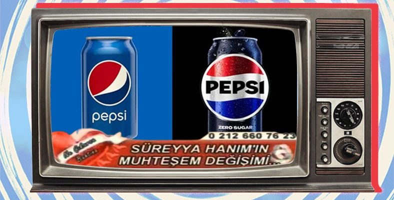
Pepsi’s logo change in the past days has made a lot of noise.
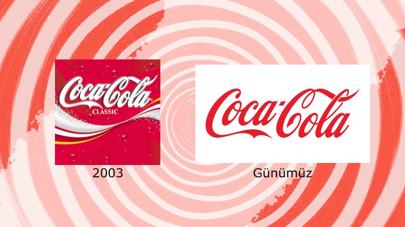
Coca Cola, on the other hand, returned to the classic design that it started to use in 1941 with the change it made.
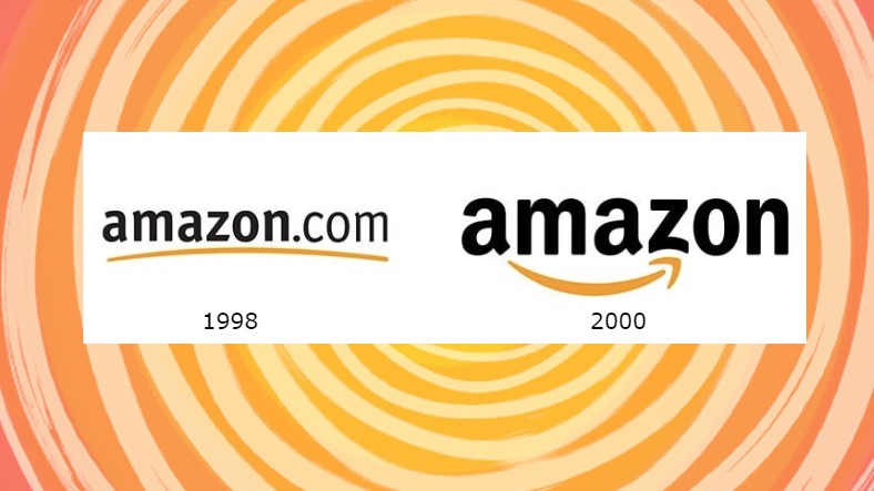
For example, Amazon tried to convey the message that it contains everything from a to z with the change it made in its logo.
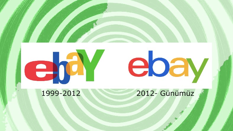
eBay, on the other hand, chose simplicity and order in the new logo.
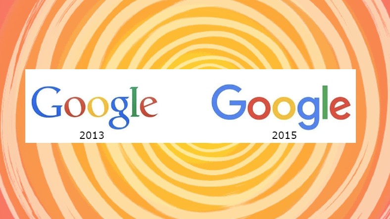
We see that Google has made minor changes in the font it uses in its logo.
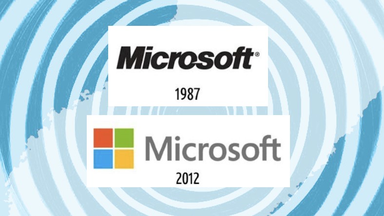
We see breezes of modernization in Microsoft’s change in its logo.
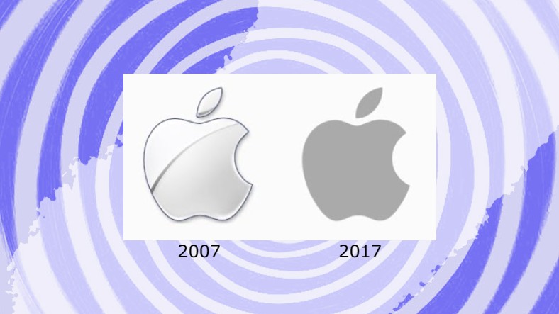
Apple has come so far in 2017 by updating its logo with small touches.
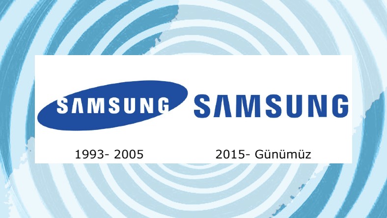
Samsung is also one of those who have tried to simplify the logo.
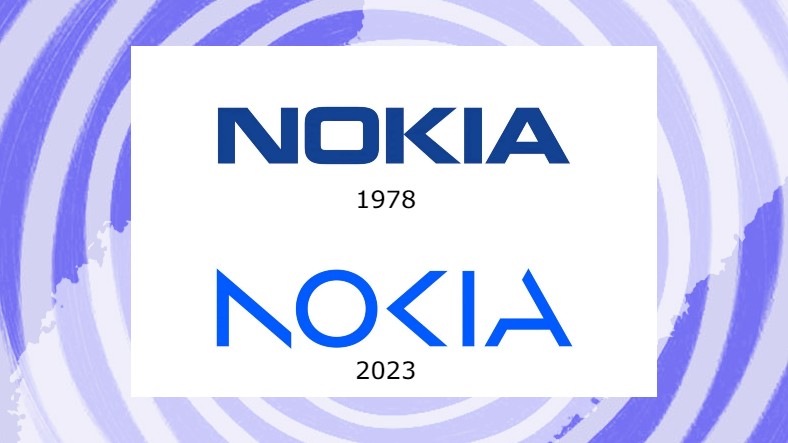
Nokia also made a big splash by changing its iconic logo in 2023.
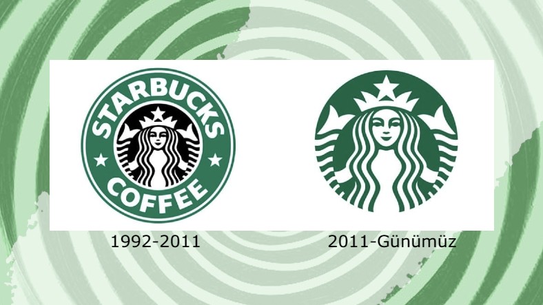
Starbucks’ iconic mermaid logo has also simplified over time.
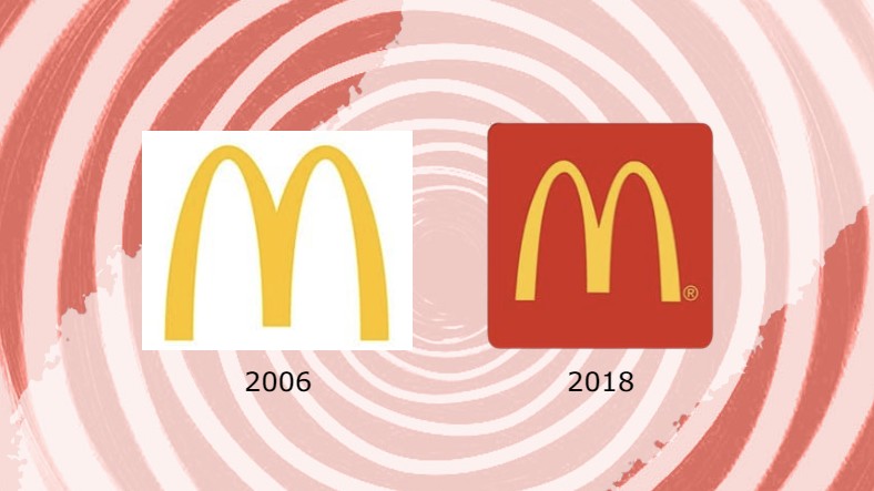
We see that McDonald’s preferred to revise the logo by choosing to add some color to its famous logo in 2018.
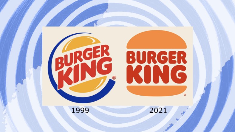
Burger King, on the other hand, is one of those that made radical changes in its logo.
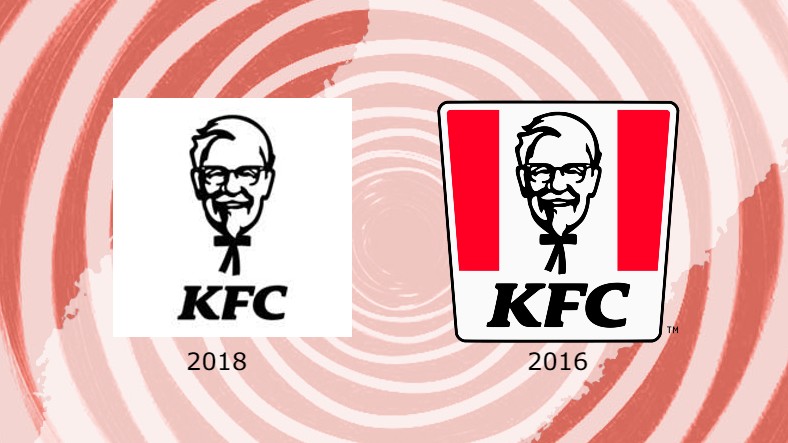
We can say that KFC also added a little color to the logo by making a touch to remind the buckets that have become synonymous with it.
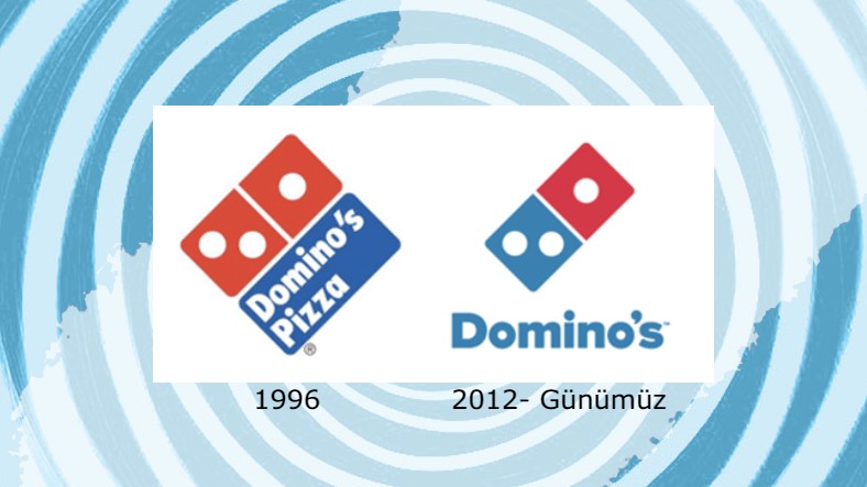
Domino’s Pizza is also one of those who have tried to simplify their logo.
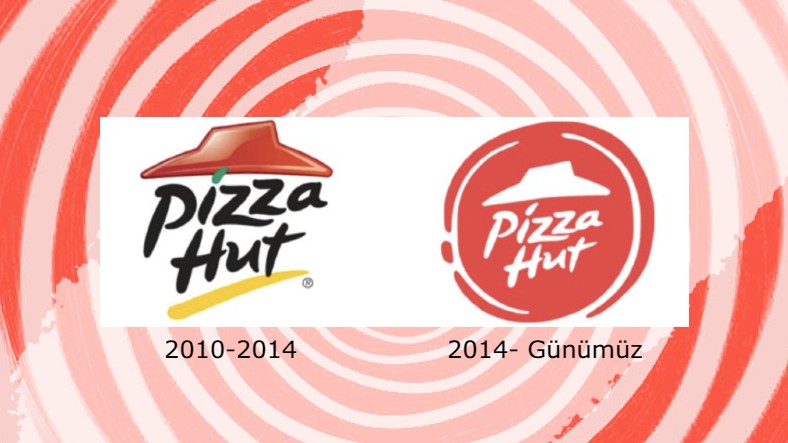
If we look at the logo change made by Pizza Hut, we can say that simplification is preferred in the pizza industry.
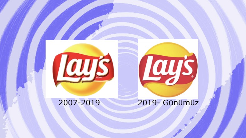
Lay’s preferred a more elegant design with softer colors by softening the lines of its logo.
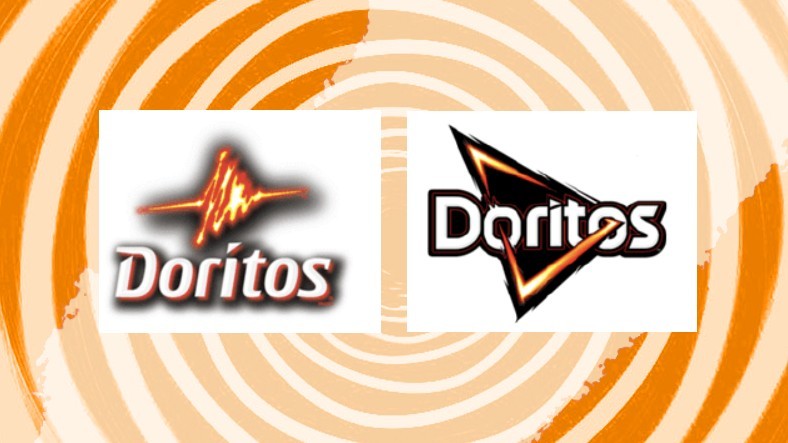
Doritos updated its logo with a more innovative design by not giving up its iconic triangle figure.
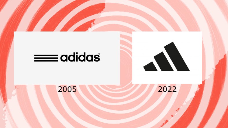
Although Adidas uses different logos for different product lines, it generally focuses on showing the three lines in new designs.
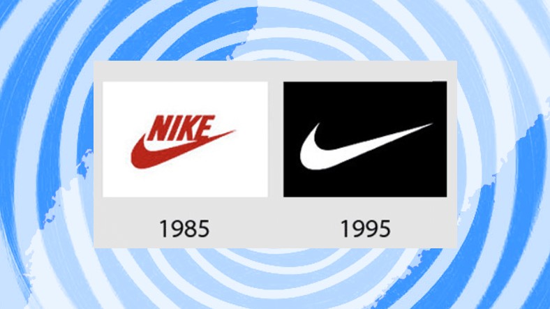
We see Nike making an update to highlight the iconic logo known as the “swoosh”.
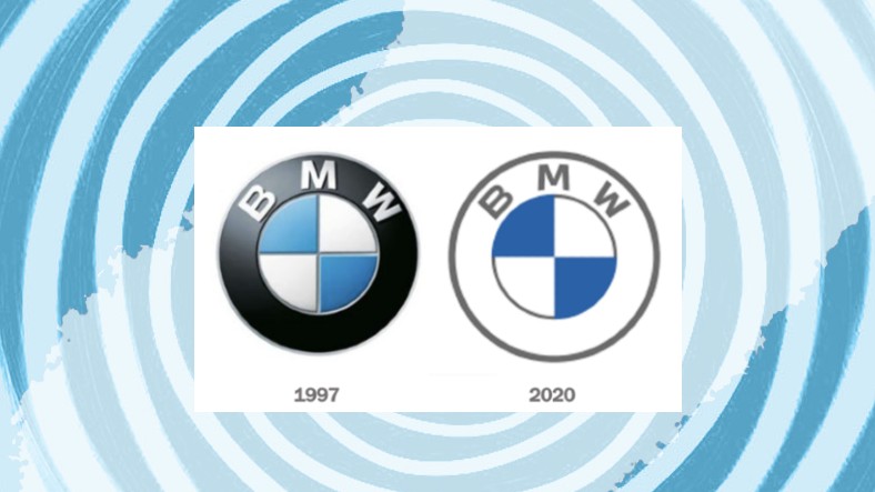
If we look at the automobile industry, we see that BMW has made a radical simplification decision in its logo.
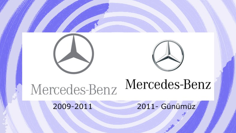
The Mercedes logo, on the other hand, has undergone a modernization after 2011.
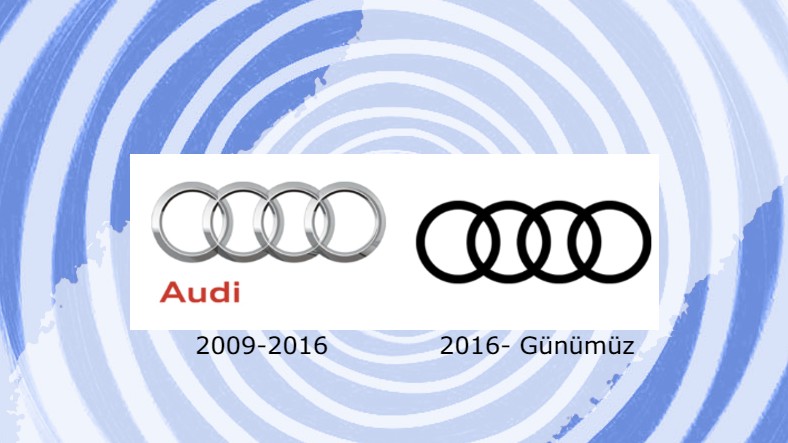
Audi, on the other hand, has switched to a plain and simple logo, the opposite of its competitors.
In this article, some well-known brands that have an important place in our lives current changes they have made to their logo we compiled. Which one was your favourite? Do not forget to specify in the comments.
RELATED NEWS
14 Badly Designed Logos You’ll Say “My 5-Year-Old Nephew Could Draw Better In Paint”
RELATED NEWS
18 Logos Designed to Make Mischief Sneaky Smile
RELATED NEWS