Google has changed the font and logo it uses for Android. The change we expect to see on smartphones with Android 14 includes an interesting aspect. While brands have been on the path of simplification in recent years, Google has done the opposite.
US-based technology giant Google has taken a remarkable step regarding the Android ecosystem. In the statement made by the company, the Android logo has been changed specified. In addition, a new font is now used in the phrase Android. But Google, especially on the logo front an unexpected move has done.
Google in the Android brand last in 2019 went to change. The new logo, which started to be used at that time, featured only the head of the Android robot and that logo was two-dimensional. In the company’s newest logo, the same robot head in three dimensions We see it redesigned. However, almost every company that has recently rebranded is switching to simpler and two-dimensional logo designs compared to the previous one. In a sense, everyone goes to Mersin, Google goes to the opposite situation…
Here is Android’s new logo:
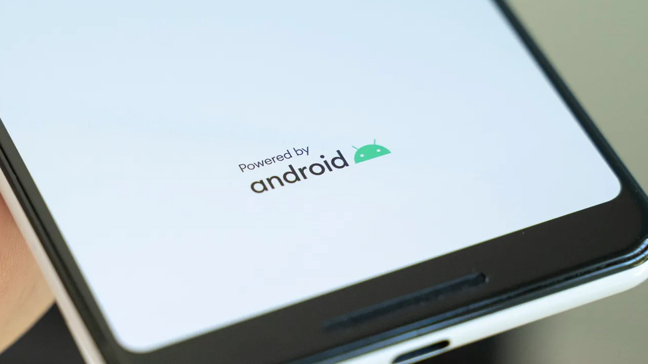
As a matter of fact, the renewal of the Android logo is not a big surprise. Because the company from CES 2023 started to use the three-dimensional logo in all the events he attended and realized. This logo is most likely Android 14 will welcome us on the opening screens of smartphones running
RELATED NEWS
25 New Features Coming with Android 14: You Will Even Say Your Wallpaper Artificial Intelligence Will Create!
In a statement to 9to5Google, it was stated: We’ll showcase some elements of our new brand identity at various locations, including at our CES booth earlier this year and other campaign materials such as digital and banner ads. We started to exhibit. We’ll have more to share in the coming months.
The renewed Android phrase looks like this:
Google has been using the term “android” directly in the Android ecosystem for a long time. So the letter A Small. However, after that, this situation will change and the letter a will be capitalized. In the letters n and r, we see a serious curve that Google, made in 2014 also preferred this curve during the rebranding process.
For those who want to remember: this is what Android’s current font and logo looks like