Giant beverage brand Pepsi announced that it has changed its logo. The new logo drew attention as it resembled the iconic Pepsi logo of the 80s and 90s.
Recently, we have been seeing giant companies from many different sectors change their logos. For example, Nokia recently changed its logo after 60 years. Automakers such as Audi, Lancia and Citroen also took such steps.
Now one of the world’s largest beverage brands. from Pepsi A similar move came. The US-based soft drink manufacturer announced that it has changed its logo.
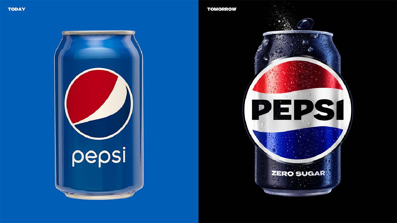
Here is Pepsi’s new logo
This change of Pepsi came after 15 years. In the previous logo, the Pepsi lettering stood next to or below the emblem with red, white and blue colors. The name of the company takes on a black color with the current change. placed in.

We see that the brand name is written in capital letters on the logo of Pepsi, which has existed for 125 years. Todd Kapplan, head of the company’s marketing division, said that the old lowercase logobrave and confident’ While he says it doesn’t reflect the mood, he says the sharper, capitalized logo can do that.
In addition, the brand’s new logo reminds of old times and therefore to a nostalgic mood We can see that he has Therefore, we can say that it looks much better than before.

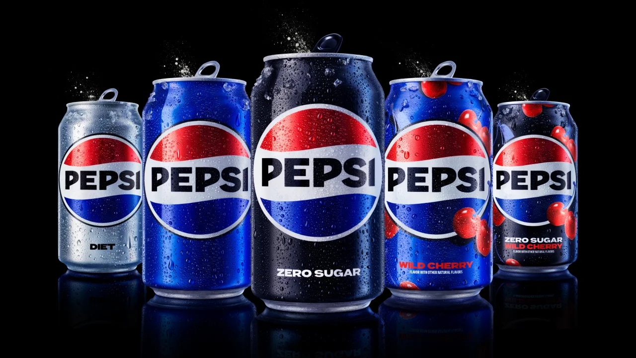
Pepsi last month sugar-free drinks announced that it would be the primary strategy of the brand. This is why the black color we see in zero-sugar colas is placed in the name in the middle of the iconic tricolor emblem. Kapplan said that they deliberately put this color in their sugar-free drinks that will lead the brand. The giant company had begun to move away from sugar as consumers began to avoid sugar.
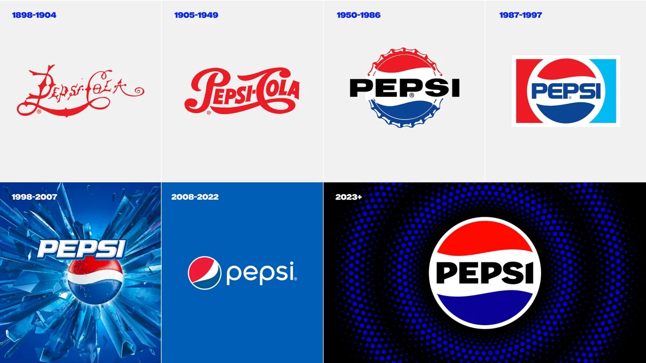
Change of Pepsi logo over the years

Pepsi has been rebranded many times since the late 1890s. The last logo change was made in 2008. Looking at the image from above, you can see that the new logo Reminds me of the Pepsi logo that was engraved in everyone’s minds from the 80s and 90s. Once again we can understand.
RELATED NEWS
